
UI MODERNIZATION FOR REWARD PLATFORM
About Client
Our client is a product company building a rewards platform for business users. It helps organizations increase engagement through structured tasks, progress tracking, and incentive mechanics. The product also supports sales and onboarding by making product benefits easy to communicate and offers flexible branding for different client needs.

Project Problems
Business
Unclear value messaging made it difficult for the sales team to clearly communicate the platform's benefits, slowing down client acquisition.
The absence of effective onboarding and sales support tools led to longer adoption cycles and increased friction during early customer interactions.
User Experience
Complex navigation and an unclear feature hierarchy reduced engagement and made the platform harder to explore.
Simple actions required too many steps, which made everyday usage feel heavy and discouraged consistent interaction.
User Interface
The interface felt outdated and did not support consistent branding across different client implementations.
Visual and interaction inconsistencies reduced the overall sense of quality and professionalism.
Technology Stack
Growing technical debt increased the cost and effort required to maintain and evolve the product.
The lack of responsive design required maintaining a separate mobile version, adding unnecessary complexity.
Backend limitations prevented the use of modern frontend frameworks, forcing the team to maintain legacy technologies while preparing for future migration.
Our Solutions
Business
We designed a structured onboarding and sales presentation that clearly communicates the platform's value, addresses common objections, and helps sales teams explain the product without relying on lengthy calls.
User Experience
We introduced interactive onboarding tasks that guide users through key features, helping them understand the product faster and start using it with confidence.
Navigation was simplified by grouping related features logically and hiding inactive or irrelevant elements, reducing cognitive load.
Daily tasks, progress levels, and reward mechanics were added to reinforce engagement and encourage regular usage.
User Interface
We created a reusable component library in Figma that supports flexible branding through configurable colors, typography, and visual styles.
A clean, modern visual language was applied to ensure consistency, improve readability, and meet corporate branding requirements.
Technical
To work within existing backend constraints, we implemented the frontend using HTML, CSS, and Bootstrap 5.3 while maintaining a clean and maintainable structure.
A centralized configuration file using CSS variables enables fast theme customization without code changes.
The frontend was integrated with the backend using structured forms and JavaScript, ensuring reliable data handling.
We designed flexible, reorderable content sections that allow clients to adjust layouts without developer involvement.
The HTML and CSS architecture was structured to simplify a future transition to a modern frontend framework once backend updates become possible.
Implementation Highlights
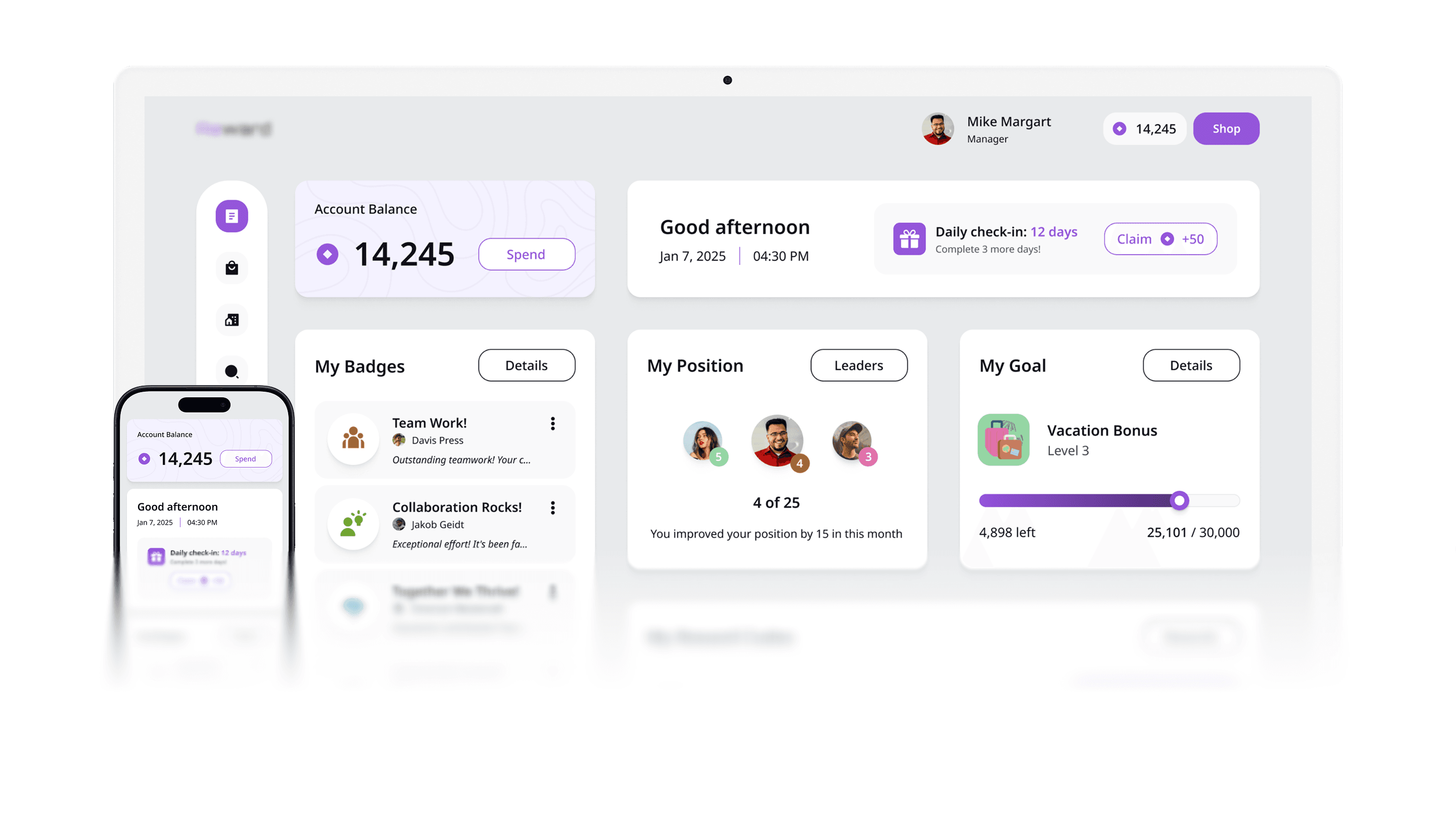
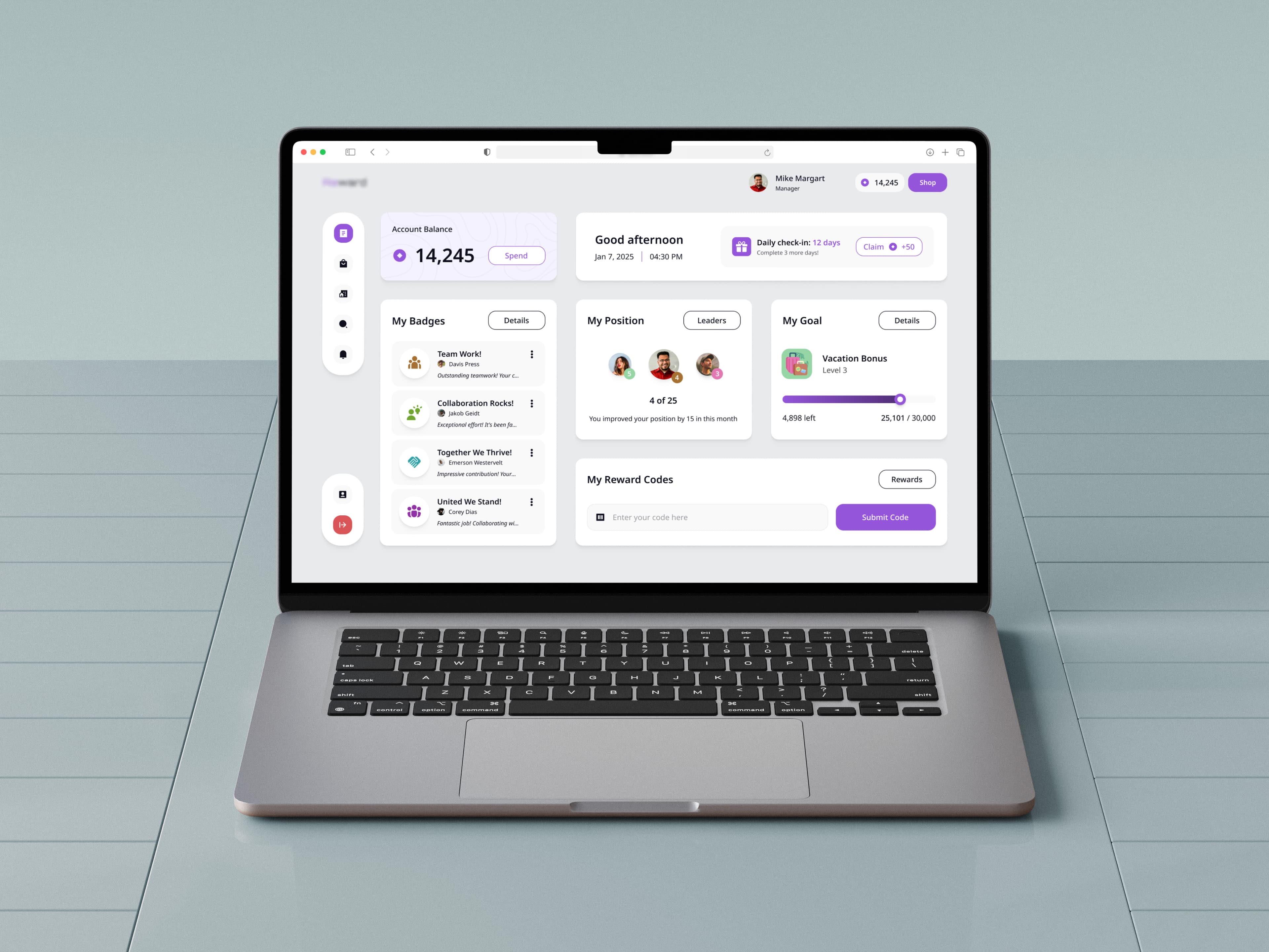
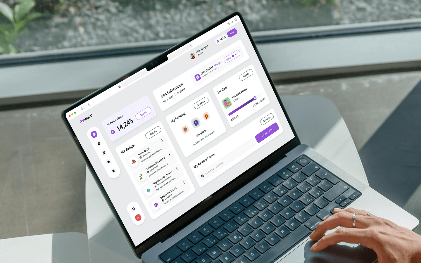
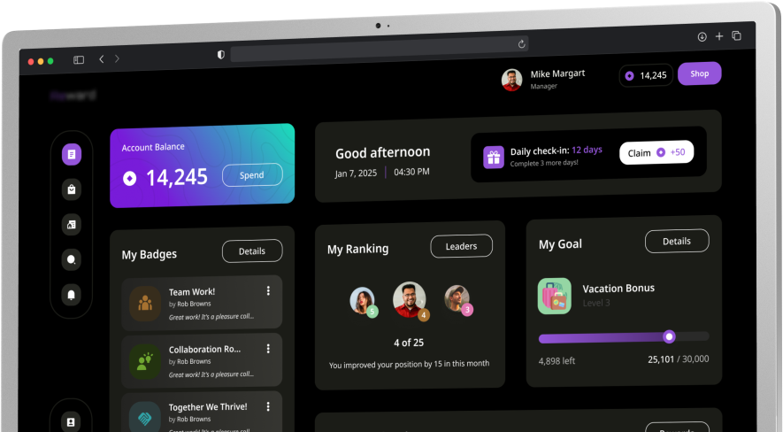
Redesigned the main dashboard as a clear starting point for users, helping them immediately understand their balance, progress, and active rewards.
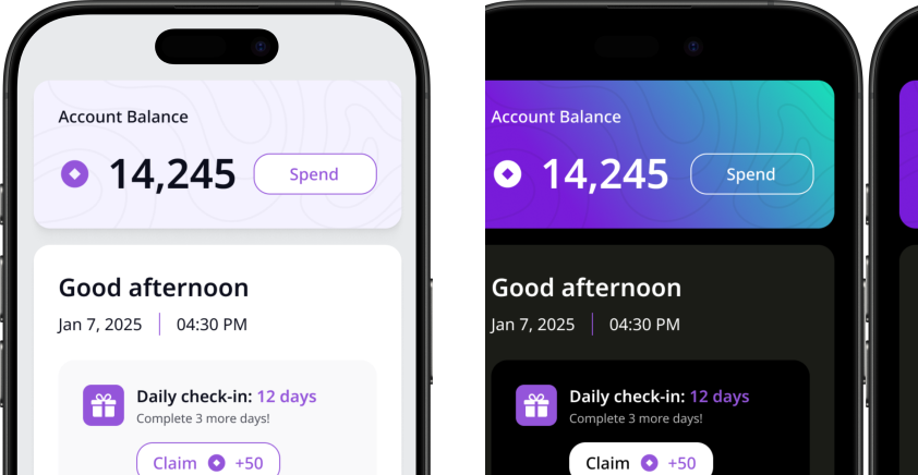
Introduced accessible light and dark themes to improve usability across different environments and user preferences.
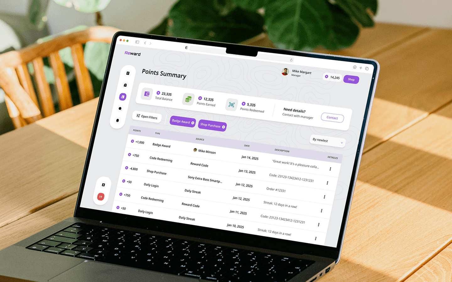
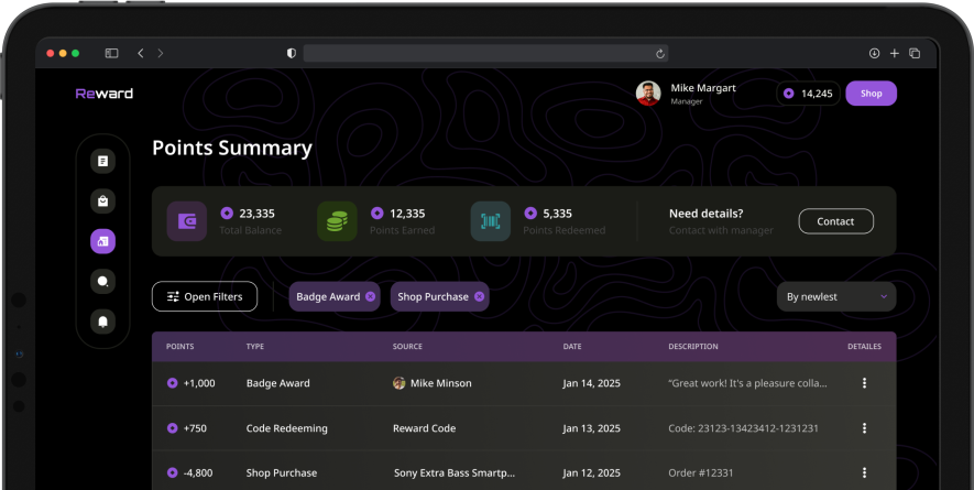
Clarified points summaries, reward progress, and key actions to make the platform easier to understand at a glance.
Let's work together
Let's create an interface that will outshine competitors and delight your clients. We will contact you within 24 hours to discuss the project and create a proposal based on your needs, budget, and timeline.