10 Best React UI Component Library Names [2026]
May 20, 2025•14 min read

I hope you enjoy reading this post. If you want us to do your frontend development or design, click here.
Author: Alex Vasylenko | Founder of The Frontend Company


Building great UIs from scratch is a waste of time. Button groups, dropdowns, modals, form validation, keyboard traps… every hour you spend reinventing that stuff is an hour you’re not shipping the product.
That’s why smart teams rely on the best React UI component library names.
But not all libraries are equal — some are designed for speed and simplicity, others for deep enterprise complexity, and a few hit the perfect middle ground.
In this article, I’ve collected a list of the 10 best React UI libraries you should know in 2026 — based on GitHub stars, weekly NPM downloads, and our experience working with client projects at The Frontend Company.
What is the React UI Component Library?
React UI component libraries are collections of reusable user interface elements — like buttons, modals, dropdowns, tables, and inputs that help accelerate software development. Instead of coding these from scratch every time, you can just copy-paste them and focus on building features.
The best React UI component library includes accessibility, theming, responsiveness, and performance optimizations out of the box — so you can ship faster with fewer bugs and less boilerplate.
Best React UI Component Library Options
Here is the list of the best React component libraries in 2026 with key features, use cases, and numbers:
1. MUI (Material UI)
MUI is the best React UI component library on GitHub that brings Google's Material Design principles and offers a comprehensive suite of free UI tools to help you ship new features faster.
It's ideal when you want consistency, accessibility, and a massive component ecosystem, without reinventing the wheel.
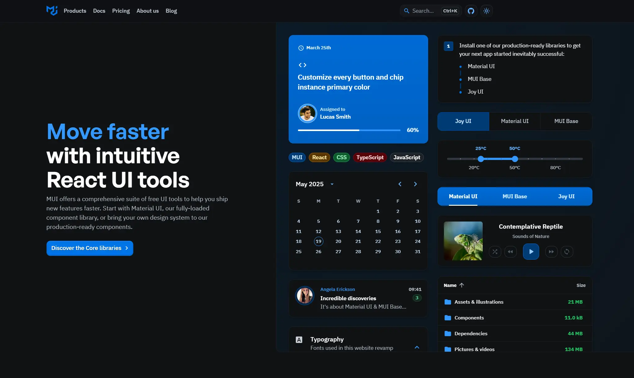
KEY FEATURES:
100+ fully accessible, customizable components
MUI gives you everything from buttons and modals to complex tables and layout systems for free.
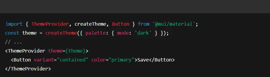
Built-in theming and dark mode support
Use sophisticated theming features to make the MUI X components look exactly how you want. You can customize the theme to your preferred choice using the ThemeProvider component.
Design kits for Figma
MUI comes with well-maintained Figma libraries, making handoff between designers and developers smoother and faster.
Works with Next.js, Remix, Gatsby, etc.
MUI is framework-agnostic and plays well with all major meta-frameworks, including full support for SSR and hydration.
Developer Friendly
The documentation is well-written, so developers can easily understand and use the library. The components are also easy to import and implement.
HOW IT WORKS:
Developers install the @mui/material package and import components like Button, TextField, etc. Typically, you wrap your app in MUI's <ThemeProvider> to apply a theme. For example:
NUMBERS:
BEST USE CASES:
Perfect for enterprise dashboards, internal admin panels, SaaS products, and apps where consistency, accessibility, and rapid development are key.
Especially well-suited for fintech, healthtech, and edtech platforms that need scalable UI components backed by strong documentation and a reliable roadmap.
USED BY:
Netflix — internal admin tools
Spotify — design systems for marketing dashboards
Scale.ai — internal data tooling
Shutterstock — editorial workflow interfaces
And thousands of startups and enterprise teams
2. Ant Design
This is one of my favorite libraries — and one we use a lot for React development services.
Ant Design (AntD) is a React UI component library built by Alibaba's Ant Group, tailored for building enterprise-grade React applications.
It provides a rich set of high-quality components, from basic buttons to advanced tables and charts, for building complex, data-heavy interfaces.
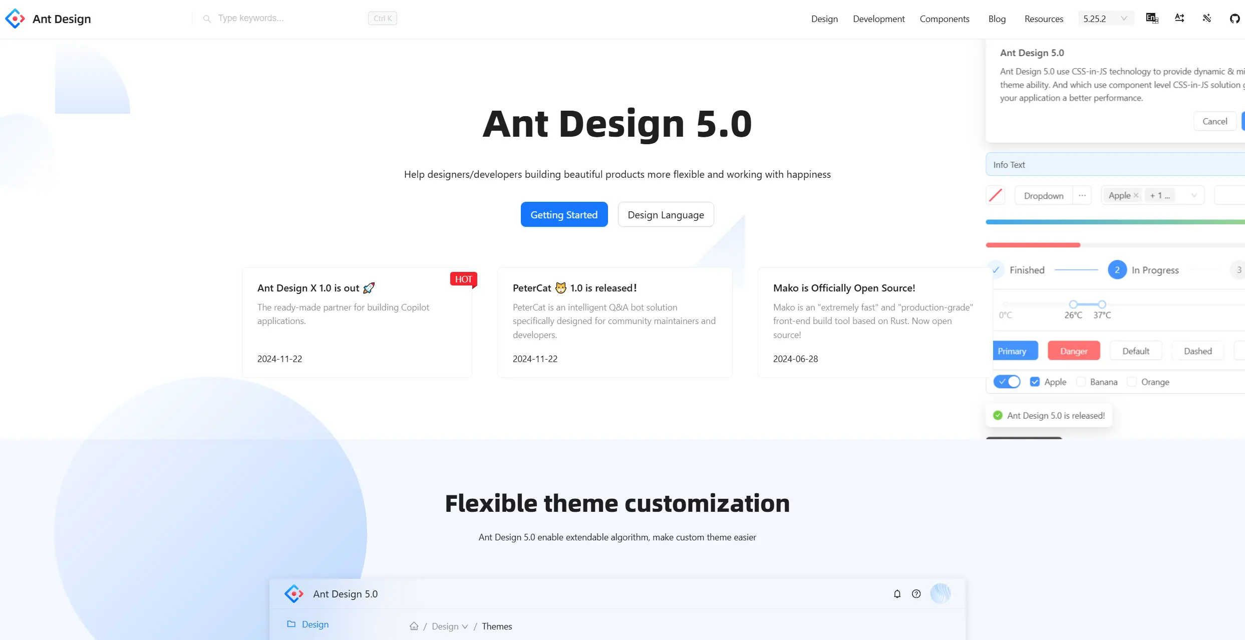
KEY FEATURES:
Enterprise-class UI for Web Applications
Built from the ground up for complex, data-heavy platforms like CRMs, dashboards, and internal tooling.
A Set of High-Quality React Components
Dozens of polished components with consistent API design — ready to use out of the box.
Design Resources & Dev Tools
Comes with design kits, Figma files, Sketch libraries, and CLI tools to speed up scaffolding and theming.
Internationalization Support
Built-in support for dozens of languages, including date/time formatting and right-to-left layouts.
HOW IT WORKS:
After installing antd, you import components and also include the Ant Design stylesheet (or use the CSS-in-JS injection). For example:

NUMBERS:
BEST USE CASES:
AntD shines in large-scale enterprise systems, CRMs, CMSs, admin panels, fintech products, and internal platforms that need dense UIs and advanced components out of the box. It's a go-to choice for teams that value a consistent UX and are building multi-language or data-heavy applications.
Especially popular in B2B SaaS, HR tech, logistics, and financial tools.
USED BY:
Alibaba — multiple internal systems and dashboards
Baidu — enterprise web applications
Xiaomi — product management tools
Lenovo — internal admin portals
Tencent — backend dashboards
Heavily adopted in the APAC enterprise market.

Transform your UI for peak performance!
🔹
Unlock seamless, high-performance frontend solutions tailored to your business.
🔹
Get an interface that outshines competitors and delights your users.
3. shadcn/ui
shadcn/ui is a unique React UI component library that provides beautifully designed components built with Tailwind CSS and Radix UI primitives.
Why is it unique? Because you don't install shadcn/ui as a dependency – instead, you copy and paste component code into your project as needed.
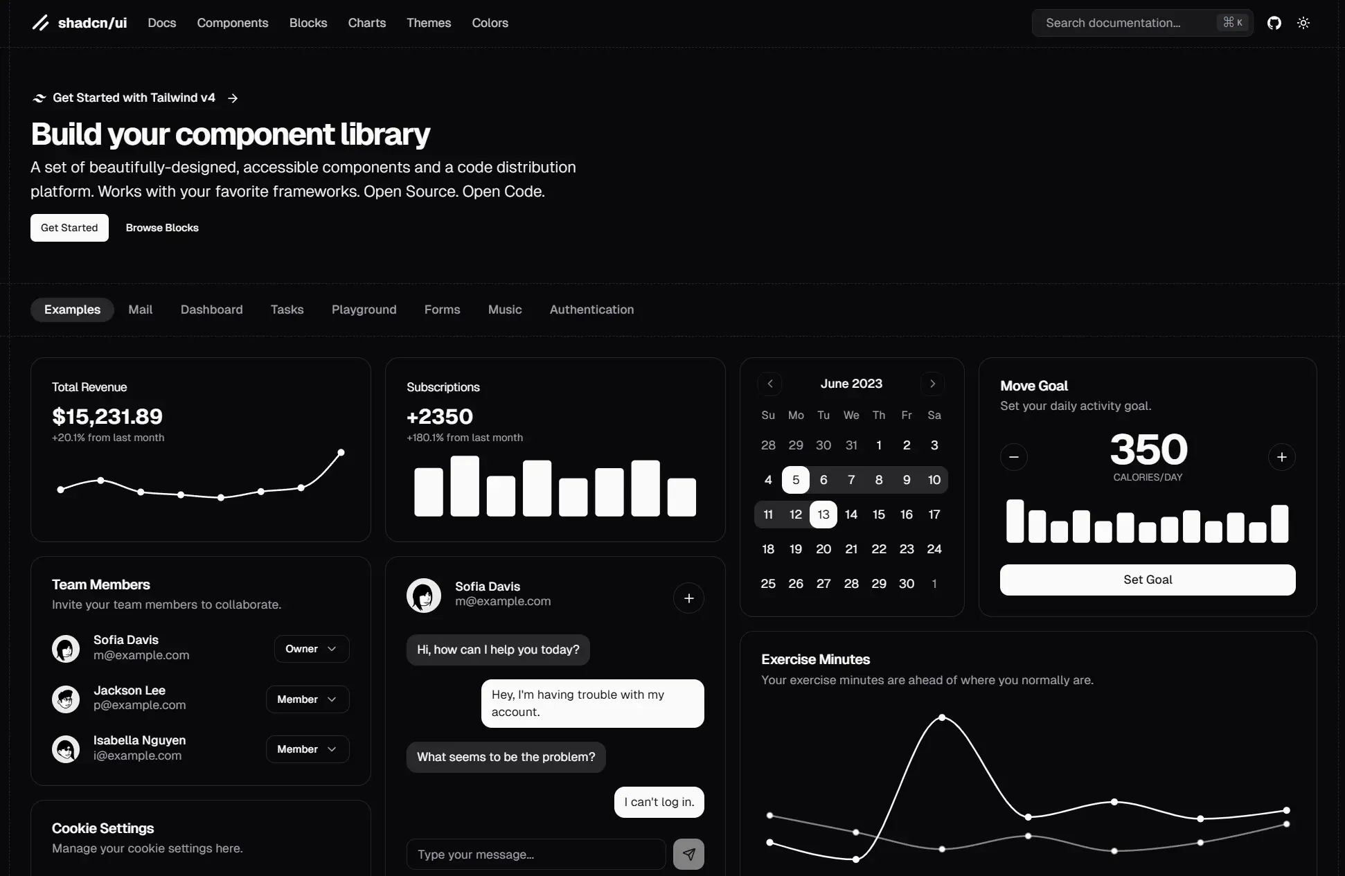
KEY FEATURES:
You own the code
You don't install a package — you copy real component files into your app. That means full control, no lock-in, and no weird overrides.
Easy to customize
Since the components live in your codebase, you can edit anything. Change the layout, tweak the behavior, or completely restyle it — no limitations.
Minimal and clean
No extra config, no bloated APIs. Just clean, modern components that do exactly what you expect.
Covers all the basics
Includes essentials like buttons, forms, dropdowns, modals, and tables — everything you need to build apps.
Built for modern stacks
Perfect for projects using Tailwind, Next.js, or building a custom design system without the baggage of a full UI library.
HOW IT WORKS:
You use shadcn/ui by visiting its documentation site (or using its CLI) and selecting a component. For example, to use a dropdown menu, you'd copy the JSX and Tailwind classes from the docs and paste it into your project. The code might use Radix UI under the hood for logic. Once pasted, it's your code – you can change class names, add features, etc.
A quick example:

NUMBERS:
BEST USE CASES:
shadcn/ui is ideal for teams building custom design systems with Tailwind and Radix, who want complete control without reinventing accessibility and structure.
Great for SaaS apps, dev tools, marketing sites, and any product that needs flexibility without complexity.
USED BY:
Vercel — UI patterns and examples
Taxonomy — the full-stack starter kit from the same creator
Fast adoption in the indie SaaS, design system, and frontend tooling communities.
4. Chakra UI
Chakra UI is a component system for building products with speed. With this React UI library, you spend less time writing UI code and more time building a great experience for your customers.
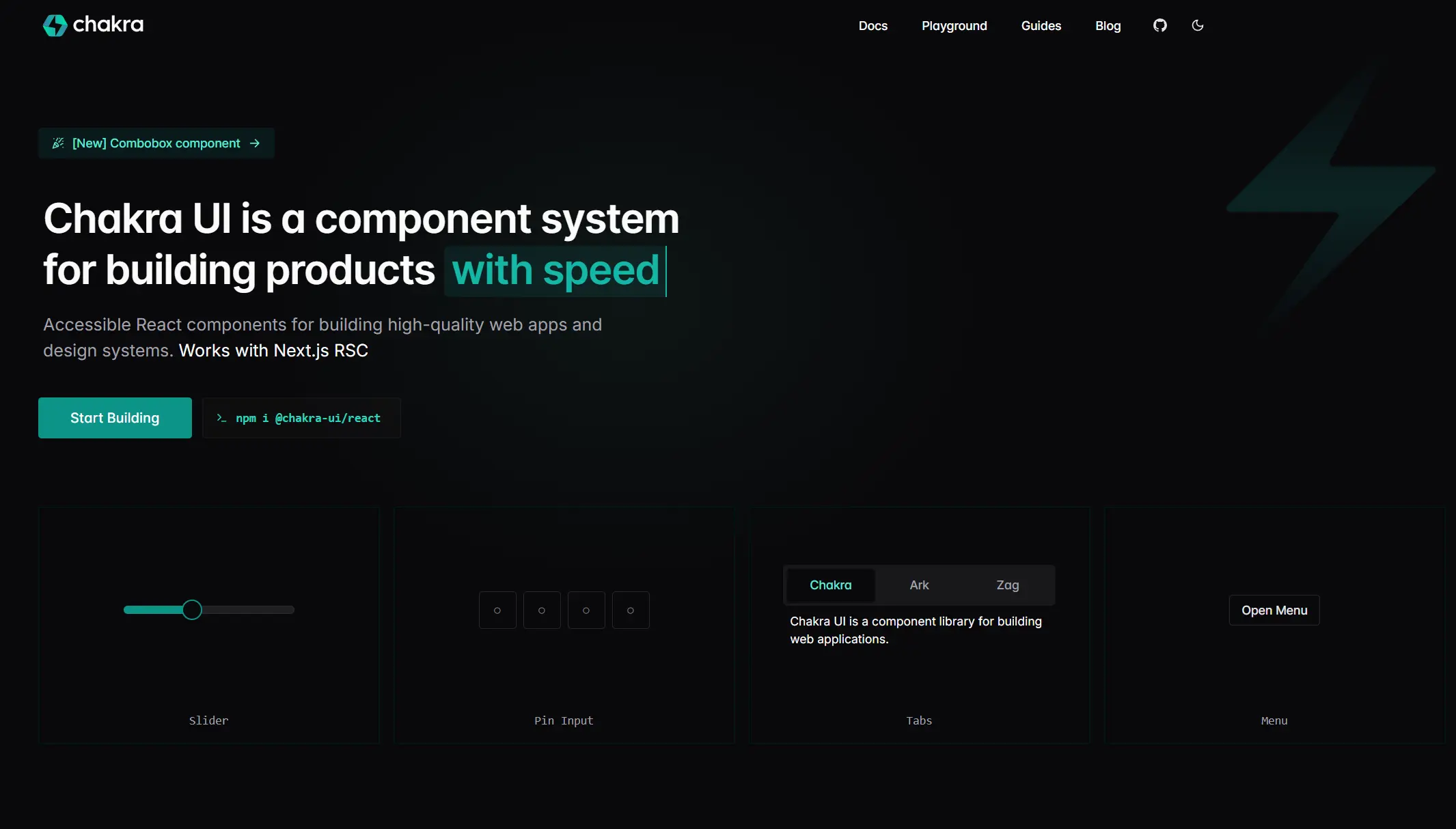
KEY FEATURES:
Simple, Modular Components
Chakra provides a set of clean, composable components designed for accessibility and reuse.
Style Props API
Control padding, margins, colors, borders, and more using intuitive JSX props. It feels like writing CSS directly in your components, but smarter and scoped.
Built-in Dark Mode Support
Chakra includes full dark mode support using useColorMode. You can easily toggle between light and dark themes without re-architecting your UI.
Fully Typed with TypeScript
Includes full TypeScript definitions, so you get autocompletion and type safety across every component and utility.
Easy theming
Chakra comes with a full theming system. Define your brand colors, fonts, spacing, and breakpoints in one place, and it applies everywhere.
Layout primitives that scale
Components like Box, Flex, Grid, and Stack make layout fast and consistent — without relying on third-party utilities.
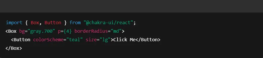
HOW IT WORKS:
After installing @chakra-ui/react and wrapping your app in ChakraProvider, you can use components with style props. For example:
NUMBERS:
⭐ GitHub: 39k stars
📥 NPM: 684k downloads/weekly
💰 Chakra UI Pro - from $299 for individuals
BEST USE CASES:
Chakra is ideal for teams building design systems, dashboards, MVPs, and marketing sites that need fast styling and built-in accessibility.
It's beneficial for frontend-heavy apps that need flexibility and a clean visual structure.
An excellent fit for modern SaaS products, dev tools, and design-led projects.
USED BY:
Supabase — developer dashboard
Hashnode — blogging platform
Mirror.xyz — Web3 publishing tools
Near Protocol — blockchain explorer
Widely used across open source, startups, and solo developers
5. Mantine
One more good React UI component library in my list is Mantine. During my career, I used it sometimes, as it includes more than 120 customizable components and 70 hooks to cover you in any situation. It is also open-source and TypeScript-supported.
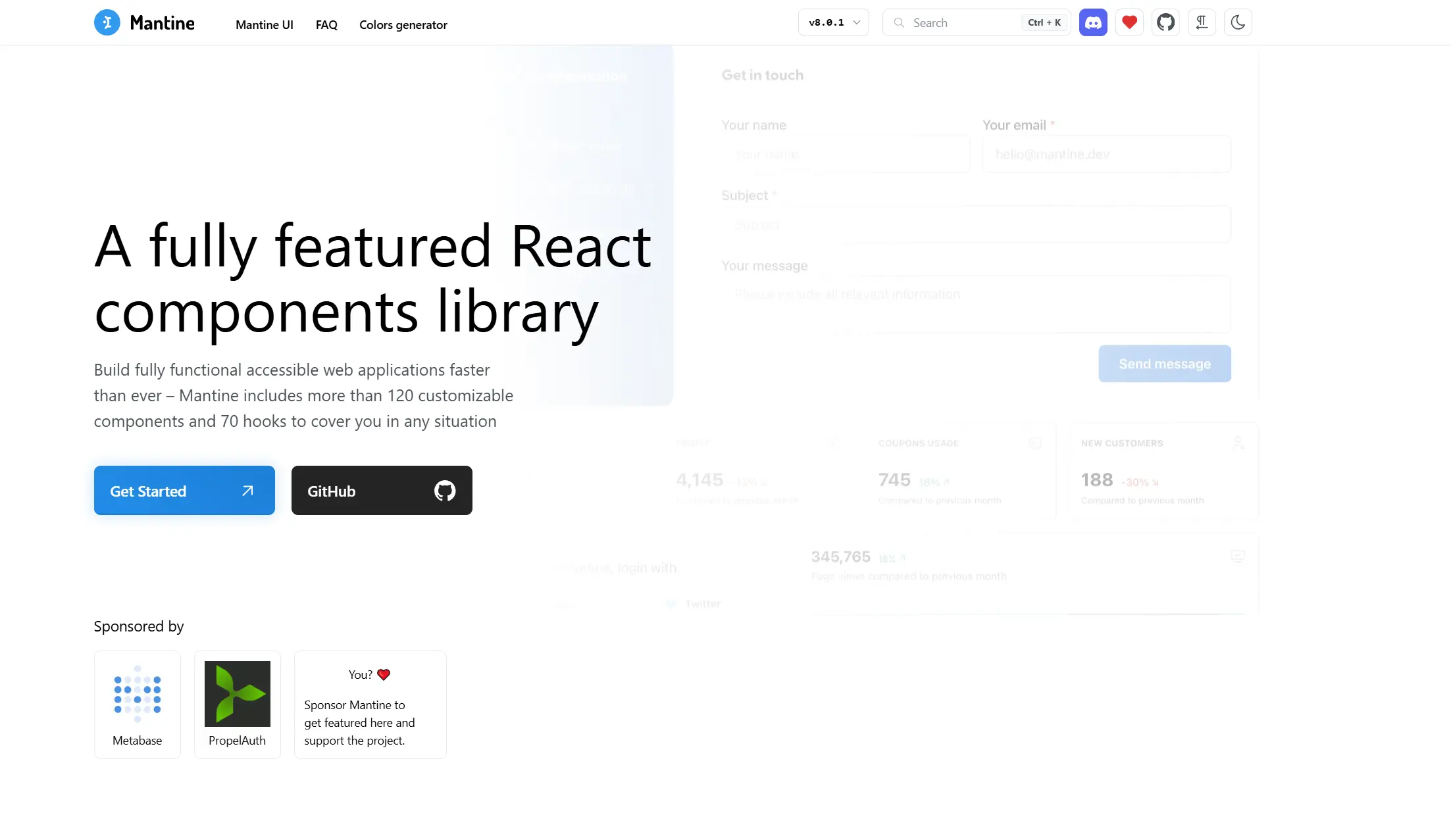
KEY FEATURES:
Full dark mode + theming
Easily toggle between light and dark themes. Customize everything — from border radius and colors to spacing and typography.
Built-in accessibility and RTL support
Every component is built with accessibility in mind and supports right-to-left layouts out of the box — no hacks or plugins needed.
Performance
Mantine supports tree-shaking and includes optimizations like virtualized lists, so you're not dragging around unused code.
Useful hooks and utilities
Comes with dozens of helpful hooks like useDisclosure, useMediaQuery, useDebouncedValue, and useHotkeys — saving developers from writing repetitive logic.
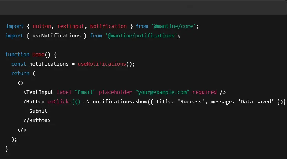
HOW IT WORKS:
After installing Mantine @mantine/core and optional packages like @mantine/hooks, you wrap your app in <MantineProvider> to apply global theme settings. Then, you can use components directly. For example:
NUMBERS:
BEST USE CASES:
Mantine is great for teams that want to ship fast without compromising on UI quality. It's perfect for dashboards, SaaS products, admin panels, and modern B2B tools where visual polish and speed matter.
It’s also a strong choice for solo developers or startups who want to avoid gluing together dozens of packages.
USED BY:
Highlight.io — observability dashboards
Payload CMS — admin UI and content tools
Medusajs — e-commerce tooling
Gaining adoption across startups, dev tools, and modern SaaS products
6. Headless UI
Headless gives developers unstyled, accessible components that are built to work seamlessly with Tailwind CSS. It doesn't care how things look — it just gives you rock-solid behavior for UI patterns like modals, popovers, tabs, and menus.
If you love Tailwind but don't want to write your own accessibility logic, Headless is what you need.
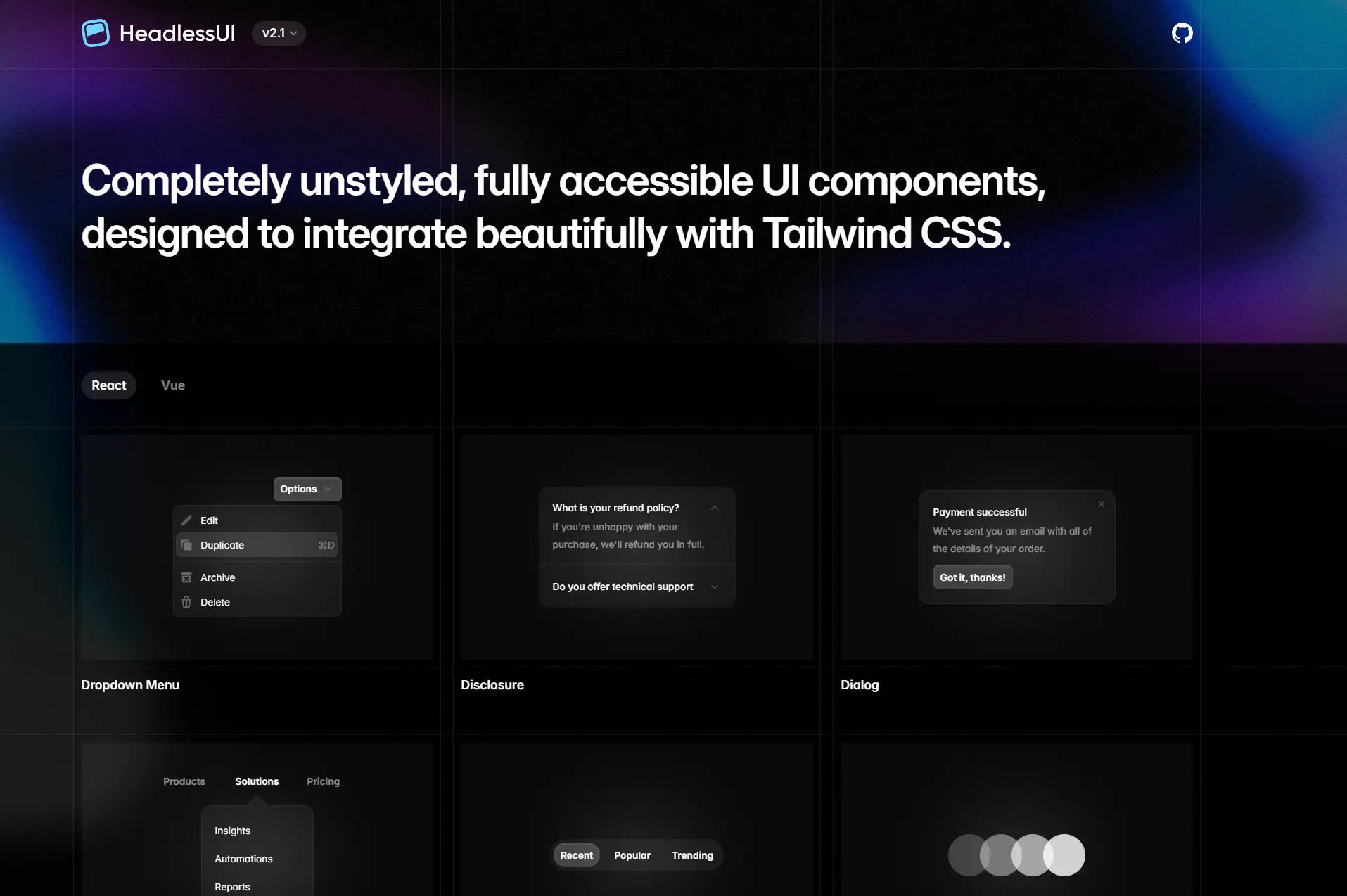
KEY FEATURES:
Minimal, focused, and fast
No bloated docs, no wasting time — just the components you actually need. Everything is right there on the homepage, with clear examples you can copy and paste in seconds.
Built for Tailwind — by Tailwind
Designed by the same team behind Tailwind CSS, Headless UI fits perfectly into any Tailwind project. It gives you structure and behavior, and you layer on the design however you want.
Unstyled by design
You get structure and logic — no CSS, no opinions, no styles to override. You just add your own classes or styles.
First-class support for React and Vue
Headless UI works with both frameworks, making it a smart choice for teams using mixed stacks or migrating between ecosystems.
HOW IT WORKS:
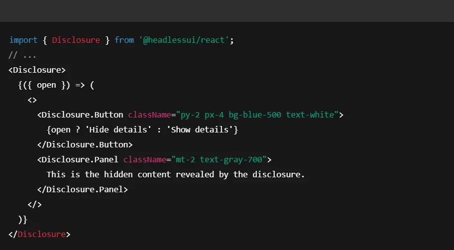
Using Headless UI typically involves importing the component logic from @headlessui/react and then applying Tailwind classes. For example, to create a disclosure:
NUMBERS:
BEST USE CASES:
Headless UI is a must-have for Tailwind users who want accessible components without giving up design freedom.
Perfect for devs building design systems, marketing sites, or SaaS UIs with custom visual identity.
USED BY:
Tailwind Labs — powering their own components
Linear — UI composition
PlanetScale — docs and dashboard
Widely used in Tailwind-heavy design systems and developer tools
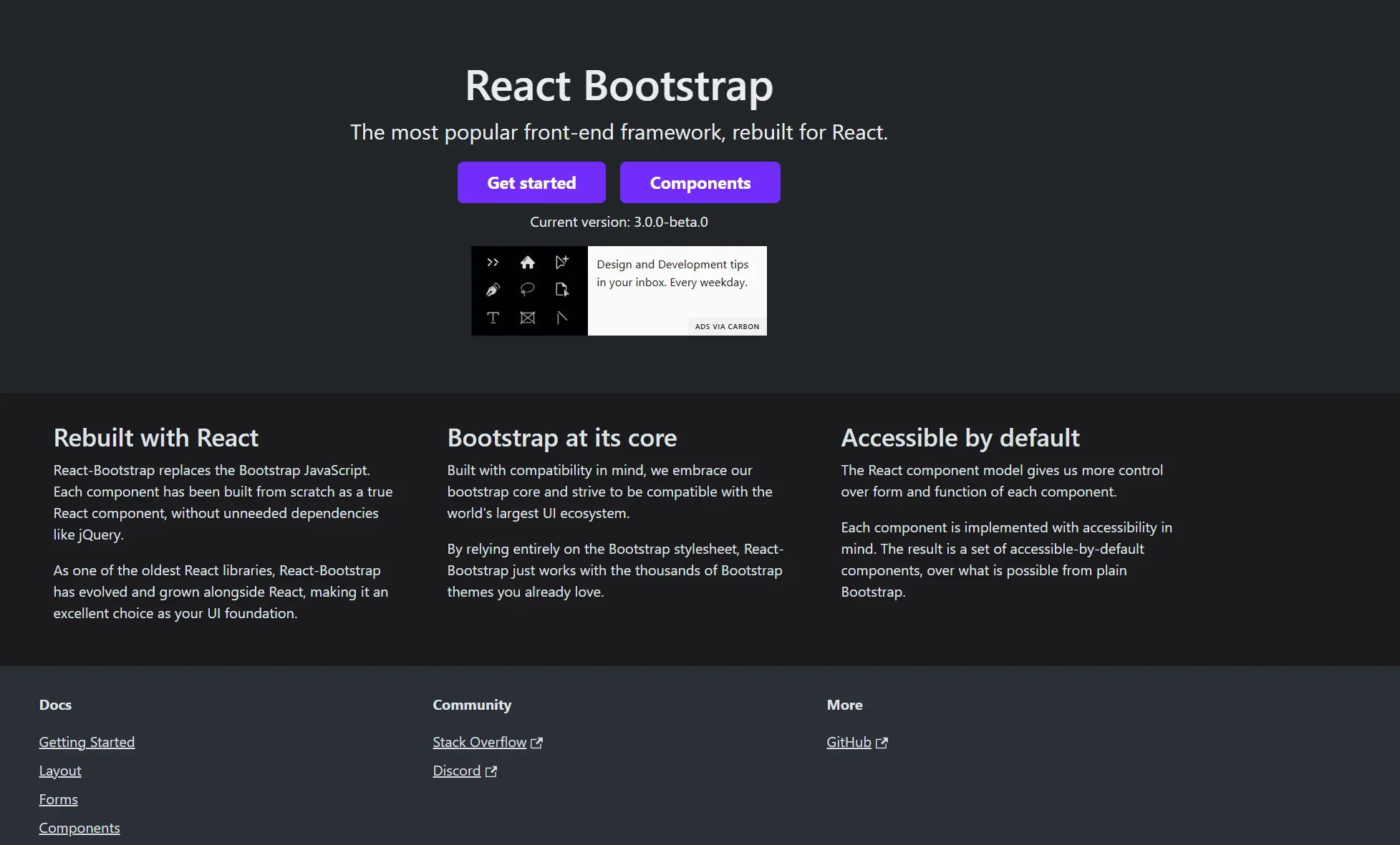
7. React Bootstrap
As the oldest React UI component library, React-Bootstrap has evolved and grown alongside React, making it an excellent choice as your UI foundation.
KEY FEATURES:
React-first version of Bootstrap
All the Bootstrap components (modals, alerts, navbars, etc.) are rewritten as proper React components with props, state, and events — no jQuery is required.
Works with Bootstrap themes
You can use free or premium Bootstrap themes right out of the box. Just drop in the styles and your React Bootstrap components will follow along.
Familiar to millions of developers
If you've used Bootstrap before, the component names, structure, and docs will feel instantly familiar. No need to relearn anything.
Community Support
React Bootstrap has elaborate documentation that explains how to use the library. Due to the large active community, there are tutorials and resources online that will also guide you on how to work with the library.
HOW IT WORKS:
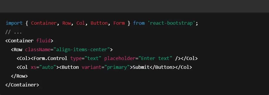
After installing react-bootstrap and (optionally) the Bootstrap CSS, you can use components like so:
NUMBERS:
BEST USE CASES:
React Bootstrap is perfect for teams transitioning from classic Bootstrap or maintaining older systems. It's a solid option for internal tools, legacy refactors, or apps where stability and familiarity matter more than visuals.
Best for enterprise teams, CMS integrations, or fast internal dashboards.
USED BY:
BBC — editorial interfaces
Udemy — admin portals
Sony Music — internal tooling
Widely used in enterprise and government stacks
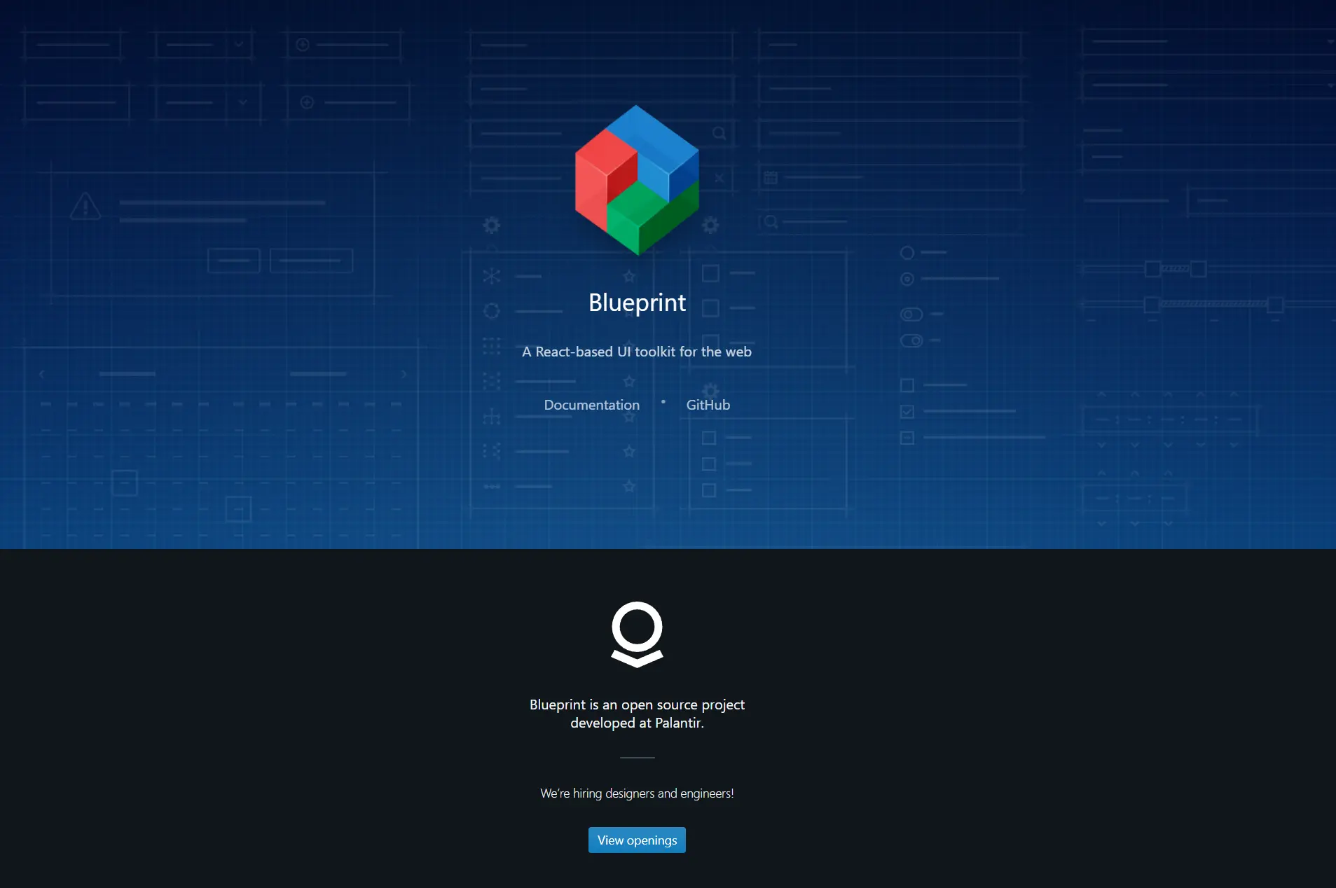
8. BlueprintJS
BlueprintJS is a robust React UI toolkit designed specifically for building complex, data-heavy interfaces — think dashboards, admin panels, analytics tools, and internal platforms.
If you're building something with a lot of tables, filters, forms, and precision interactions — BlueprintJS is the best React UI component library for this.
KEY FEATURES:
Minimal, functional design
The UI is intentionally simple. It stays out of the way, letting the content and data shine — even when your interface is packed with controls.
Huge icon library
Comes with 300+ custom-designed icons that match the Blueprint aesthetic. You don't need a separate icon library — everything you need is already included.
Performance-first
Components are optimized for speed and responsiveness, especially in desktop-heavy environments where users expect instant feedback.
Written in TypeScript
Everything is fully typed with strong TypeScript support. You get autocomplete, reliable props, and confidence as you scale.
Modular architecture
You don't need to import the whole library. Grab just the core, or add only what you need — like @blueprintjs/datetime or @blueprintjs/table — to keep bundle size tight.
Real product, not just a demo
The Blueprint docs site is built using Blueprint itself — it's not just showing you what the components do, it's using them for everything.
HOW IT WORKS:
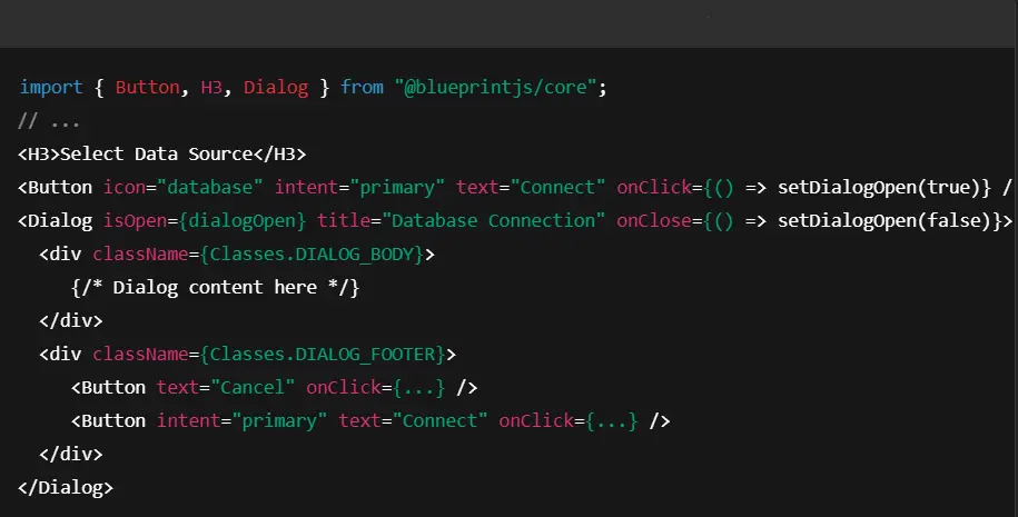
You install @blueprintjs/core and other Blueprint packages as needed. Wrap your app in Blueprint’s <FocusStyleManager> and perhaps a <ThemeProvider> if you want dark mode. Using components is straightforward:
NUMBERS:
BEST USE CASES:
Blueprint is built for apps that manage complex workflows: admin panels, analytics dashboards, internal tools, financial platforms, and anything that needs data-first design with reliable UX patterns.
Especially well-suited for enterprise, fintech, dev tools, and B2B SaaS.
USED BY:
Palantir — internal tooling and platforms
Coda — custom UI controls
Lucidchart — advanced interface components
Kensho — financial data dashboards
Frequently used across internal platforms and enterprise products
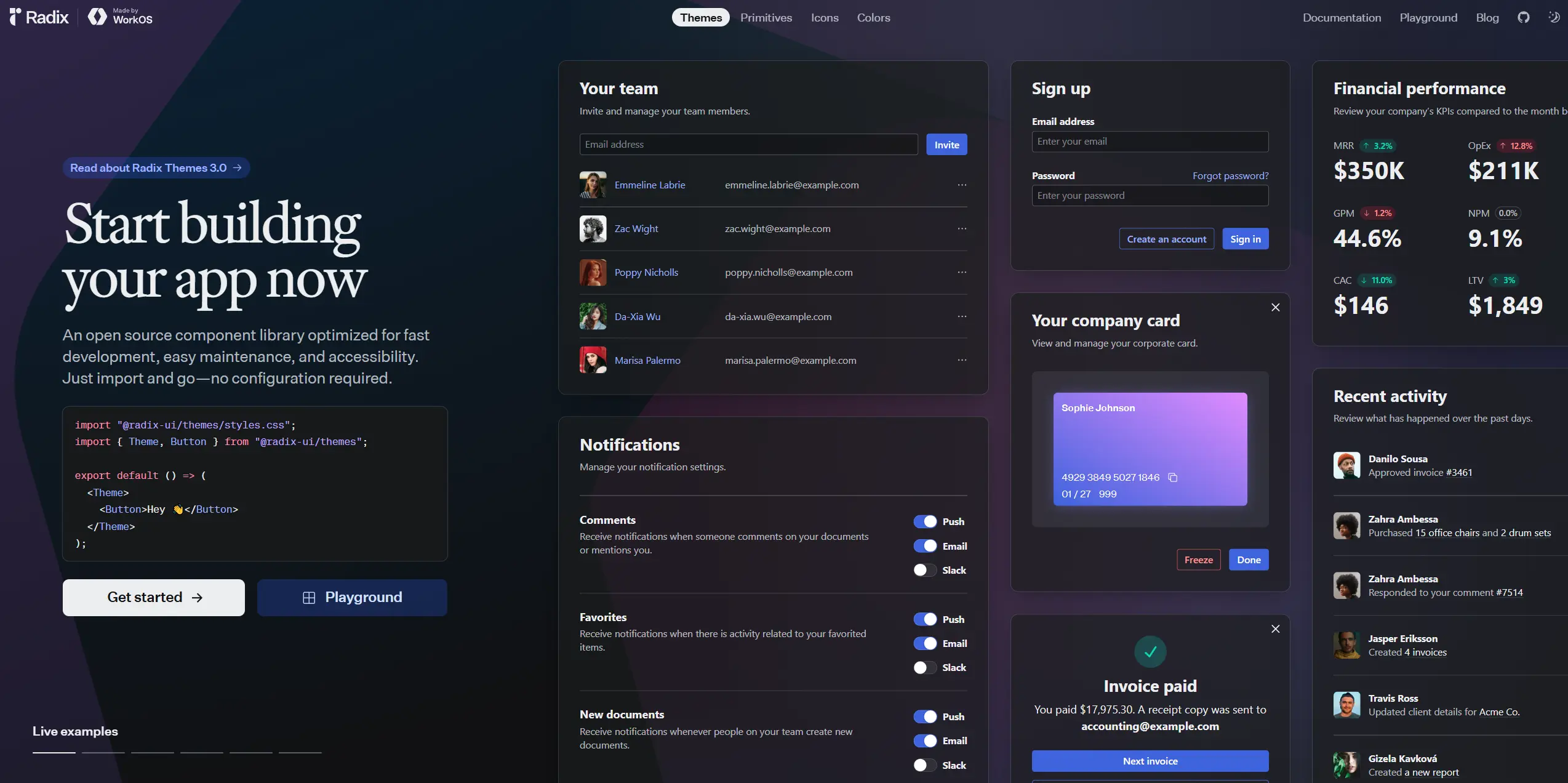
9. Radix UI
Radix is a React UI component library optimized for fast development, easy maintenance, and accessibility.
It's not for beginners. But if you're building your own design system or working on a design-heavy product, Radix UI is brilliant.
KEY FEATURES:
You're in control of the styling
No more overriding someone else's design tokens or hacking inline styles. Radix gives you pure, clean behavior and zero opinion about how things should look. You design it your way, with your stack.
Accessibility isn't your problem anymore
Focus traps, keyboard navigation, ARIA roles, screen reader behavior — all the painful stuff nobody wants to build from scratch. Radix helps with it. You just drop in the logic and keep moving.
Composability that works
You don't get boxed in. Every component is split into smaller parts like Root, Trigger, Content, so you can nest, wrap, and extend — whatever your UI demands.
Integrates with anything
Whether you're using Tailwind, styled components, CSS Modules, or writing raw CSS, Radix doesn't force any styling method. You get the logic, and you plug it into your workflow.
SSR ready
Designed to play nice with Next.js, Remix, and other frameworks where hydration bugs usually ruin your day.
HOW IT WORKS:
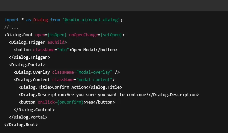
You install @radix-ui/react-dialog and use it in JSX, then style via CSS or a styling library. For example:
NUMBERS:
BEST USE CASES:
Best suited for teams building custom design systems, highly branded UIs, or design-heavy products. If you want to implement your own look but still follow accessibility best practices, Radix will save you dozens of hours per component.
Used heavily in developer tools, design platforms, no-code builders, and any app where native behavior matters more than preset visuals.
USED BY:
Vercel — custom UIs in marketing and dashboard tools
Linear — high-performance product UI
Superhuman — keyboard-driven interactions
Stately.ai — complex editor UI
Widely used in modern, design-driven dev tool startups
10. PrimeReact
PrimeReact is a feature-packed React UI component library that comes with over 80 components — including advanced trees, data tables, calendars, charts, and file uploaders. It’s part of the Prime family (alongside PrimeNG, PrimeVue, etc.) and is heavily used in enterprise apps where UI depth matters more than design.

KEY FEATURES:
Advanced components
Includes rare, high-complexity components like Gantt charts, organization charts, splitters, tree tables, drag-and-drop lists, and multi-step wizards — perfect for enterprise apps.
Ready-made themes and templates
Comes with a wide range of themes (including Material, Bootstrap, Fluent, and PrimeOne). You can also buy premium themes if you want something more polished.
Fully responsive and mobile-friendly
Components adapt to different screen sizes by default — great for apps that need to work on tablets or internal dashboards with split-screen workflows.
Active development and support
Maintained by a full-time team and supported commercially. Enterprise support plans and paid templates are available if needed.
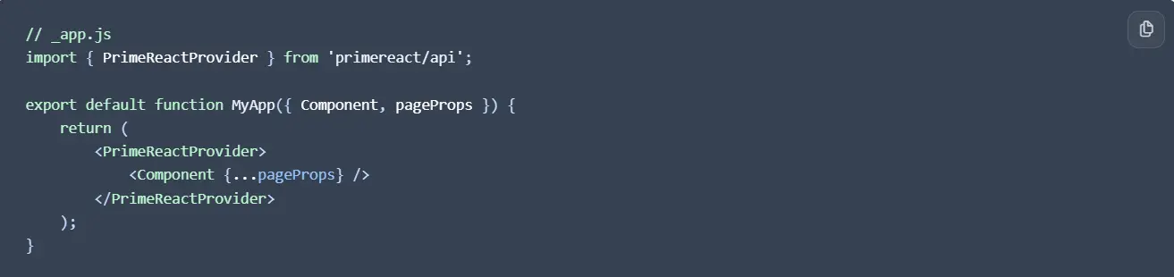
HOW IT WORKS:
Configuration is managed by the PrimeReactProvider and PrimeReactContext imported from primereact/api.

The PrimeReactProvider component is used to wrap the application, and the PrimeReactContext is used to access the configuration options.
NUMBERS:
⭐ GitHub: 7.7k stars
📥 NPM: 176k downloads/weekly
💰 Free under MIT, with optional paid themes/templates
BEST USE CASES:
PrimeReact is ideal for enterprise software, internal systems, admin panels, back-office tools, or anything that needs advanced UI widgets and heavy data interaction.
An excellent choice for ERP tools, logistics platforms, data dashboards, and dev teams that need maximum UI power with minimal glue code.
USED BY:
Mercedes-Benz — enterprise dashboards and internal platforms
NVIDIA — tooling interfaces and partner portals
Ford — internal data systems and admin panels
Siemens — large-scale internal apps
Widely used across consulting, manufacturing, and corporate IT teams
Need Help to Choose the Best React UI Component Library?
Yes, please, help me choose the best library for my development!
The Benefits of Using a React UI Component Library
Below are a few of the benefits of using a React UI component library:
Speed:
Component libraries give you a full set of production-ready UI elements — buttons, inputs, tables, modals, alerts, tooltips, and more. Pre-built components let us skip repetitive tasks and spend more time on feature releases.
Consistency:
These libraries follow strict design systems, which means your UI will look and feel consistent across every page, component, and screen — without needing a full-time designer on every task.
Productivity:
Less boilerplate means faster iteration. Libraries help you focus on functionality, logic, and business value — not rebuilding the same components for the hundredth time.
Customization:
Most modern libraries are themeable and flexible. You can override styles, extend behavior, or build your options without breaking the base.
Accessibility:
Many UI libraries prioritize accessibility, making it easier to create applications that are usable by everyone.
Strong Community Support:
The most popular libraries are maintained by large teams or companies and backed by active communities. That means frequent updates, plugin ecosystems, solid docs, and solutions to common issues already waiting on GitHub.
Wrapping Up
I tried to make this overview as useful and easy to follow as possible — hopefully, it helped you get a clearer picture of the best React UI component library options and make the right choice.
React UI component libraries are one of the most useful things we have as developers. Without them, we’d be wasting hours building the same buttons and tables over and over again.
Every library in this list offers real value — whether it’s speed, flexibility, accessibility, or just plain developer happiness. Try them, experiment, and give users a great UX.
Unlock the full potential of your product

Boost customer retention & satisfaction
Become more competitive on the market
Move to the latest technologies stacks
Improve usability & visual appeal
FAQ


Alex Vasylenko is the founder of The Frontend Company, DBC and several other successful startups. A dynamic tech entrepreneur, he began his career as a frontend developer at Deloitte and Scandinavia's largest banking company. In 2023, Alex was honored as one of 'Top 10 Emerging Entrepreneurs' by USA Today.
RATE
Rate this article please
This will help us provide more useful information.
423 ratings, average 5 out of 5