7 Best Angular UI Library Names [2026]
June 16, 2025•14 min read

I hope you enjoy reading this post. If you want us to do your frontend development or design, click here.
Author: Alex Vasylenko | Founder of The Frontend Company

Button groups, modals, form validation, keyboard traps… every hour your team spends reinventing this stuff is an hour you're not spending on releasing the product.
That's why many teams lean on the best Angular UI component libraries to move faster, stay consistent, and avoid rebuilding the same dropdown for the fifth time.
But not all Angular UI libraries are equal. Some are built for speed and developer experience. Others go all-in on enterprise complexity. And a few hit that rare sweet spot between power and flexibility.
In this article, I've collected the top Angular UI component libraries you should know, ranked by GitHub stars, NPM downloads, and my personal experience working with client projects at The Frontend Company.
Best Angular UI Component Library Options
Here is the list of the best Angular component libraries in 2026 with key features, use cases, and numbers:
Angular Material – Official Google Library
PrimeNG – Enterprise-Ready Component Suite
NG-ZORRO – Ant Design for Angular
Nebular – UI + Auth for Admin Dashboards
Clarity – VMware’s Enterprise Design System
ngx-bootstrap – Bootstrap Components for Angular
Kendo UI – Premium UI Library by Progress
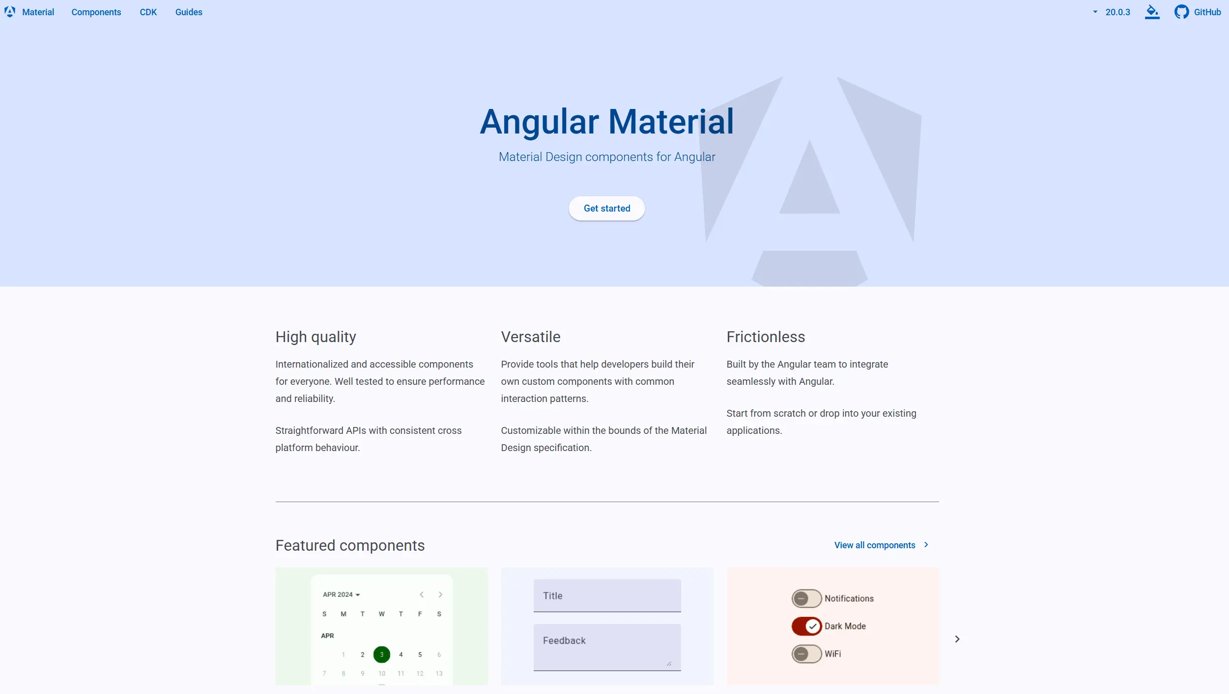
Angular Material
The most popular and widely used Angular UI library is the official library from Google. Companies that want consistent, accessible, and well-integrated components for Angular will appreciate it as Angular Material is effectively "built by Angular for Angular" – and works perfectly with its forms, routing, and animations.
KEY FEATURES:
Complete Material Design Component Set
Provides dozens of UI components (buttons, cards, modals, toolbars, menus, etc.) that strictly follow Material Design guidelines for spacing, color, and motion. Developers get professional-looking UI elements out of the box with minimal CSS tweaking.
Dark Mode and Customization
Angular Material comes with a powerful theming engine. You can choose from prebuilt Material themes or craft your own theme via Sass. Changing primary or accent colors across your app is straightforward, and you can even implement dark mode with the flick of a switch.
Responsive Layouts with Flex-Layout/Grid:
Angular Material includes the Angular Flex-Layout library and the modern CSS Grid-based layouts, making it easier to build responsive UIs that adapt to different screen sizes. There are utilities for spacing, layout alignment, and responsive breakpoints baked in.
Community and Extensions
Being so popular and free, Material has many fans. There are tons of tutorials, StackOverflow answers, and even auxiliary libraries like Angular Material Extensions and Teradata's Covalent that add extra components on top of it.
HOW IT WORKS:
Developers install Angular Material using the CLI with:
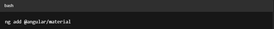
This command sets up the library, adds required themes, animations, and installs dependencies automatically. Angular Material is modular, so you only import the components you need — like MatButtonModule, MatFormFieldModule, or MatDialogModule.
You'll also need to import BrowserAnimationsModule in your app's root module to enable features like ripples and smooth transitions.
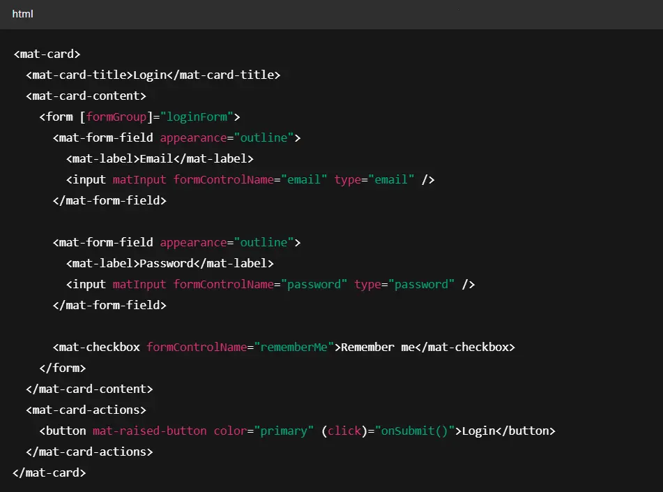
A typical example of using Material components in a login form looks like this:
NUMBERS:
BEST USE CASES:
Angular Material shines in any app where Material Design is suitable – from admin dashboards to consumer-facing apps. Enterprise back-office applications, SaaS dashboards, and Google Cloud-style UIs are common places where you'll find Angular Material.
It's best for teams that are happy to align with Material Design principles.
USED BY:
Google – Many of Google's internal Angular projects and tools leverage Angular Material.
Gmail — Portions of the Angular-powered Gmail experience rely on Angular Material.
Cloud Functions UI – Google Cloud Console uses Angular Material in various service UIs.
VMware – Has used Angular Material in their admin portals and tooling UIs.

Transform your UI for peak performance!
🔹
Unlock seamless, high-performance frontend solutions tailored to your business.
🔹
Get an interface that outshines competitors and delights your users.
PrimeNG
PrimeNG is the most comprehensive Angular UI library available. It is like a one-stop shop for all your UI needs – it offers everything from basic buttons to complex data visualization components.
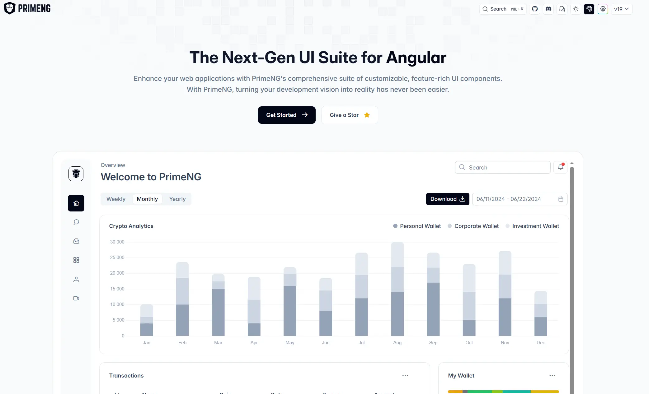
This library stands out for its enterprise focus: extensive documentation, professional support options, accessibility compliance, and a commercial theme marketplace.
KEY FEATURES:
90+ UI Components Out of the Box
Everything from buttons, dropdowns, and inputs to carousels, calendars, tree tables, and file uploaders.
Highly Customizable Theming System
PrimeNG uses a CSS-based theming engine and offers premium themes (like Material, Bootstrap, Fluent) through PrimeBlocks. You can fully restyle components without rewriting CSS from scratch.
Enterprise Data Components
Includes robust tables with pagination, filtering, sorting, lazy loading, row expansion, virtual scrolling, and even Excel export — ideal for line-of-business apps.
Commercial Add-Ons
PrimeNG can be extended with paid offerings like drag-and-drop layout editors and prebuilt UI block templates for rapid prototyping.
HOW IT WORKS:
PrimeNG components are used via prefixed tags like <p-button> or <p-table>. You don't need to worry about wiring up third-party styles — everything works out of the box.
Here's a typical use case: a table showing product data with sortable columns and currency formatting.
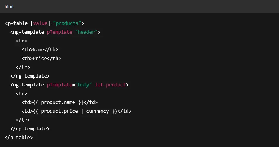
With just this markup, you get a fully functional, styled data table — complete with default theming, accessibility support, and mobile responsiveness.
NUMBERS:
BEST USE CASES:
PrimeNG is fantastic for enterprise applications and dashboards where you need a lot of functionality quickly. Fintech, healthcare, and all apps when you need complex data to display or interact with – PrimeNG is the best Angular UI component library.
On the flip side, if your app is very lightweight or only needs a few basic components, PrimeNG might be overkill in features and bundle size. Also, apps that need an absolutely unique UI design might not want to rely too much on a pre-themed library.
USED BY:
eBay — Internal analytics and operations dashboards
Fox — Enterprise media tooling
Airbus — Engineering and data-intensive internal apps
Lufthansa Systems — Travel and airline systems
Barclays — Financial reporting dashboards
And thousands of startups and enterprise teams are building scalable, data-rich Angular applications.
NG-ZORRO
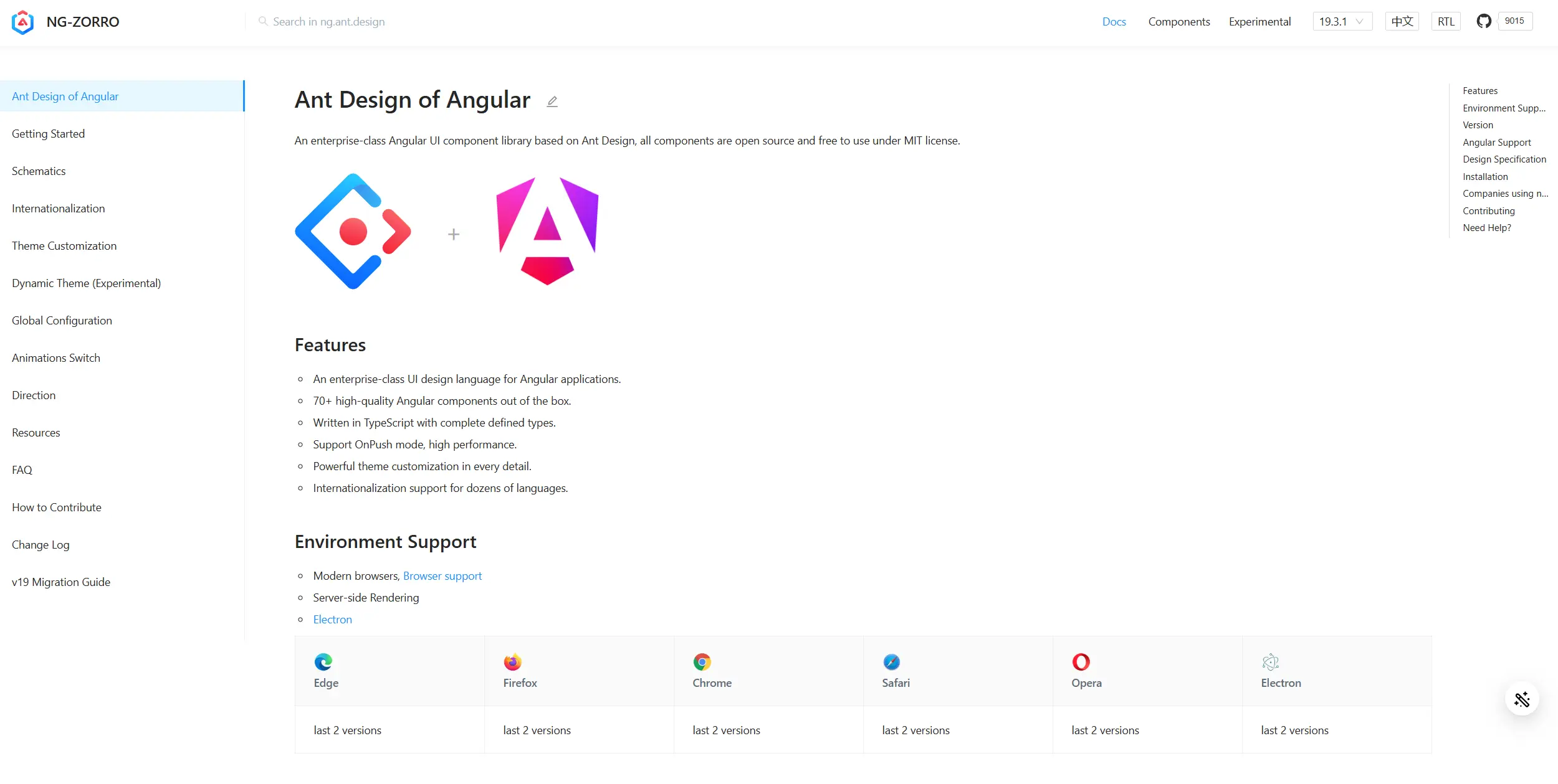
NG-ZORRO is an enterprise-class Angular UI component library based on the Ant Design system. Originally developed by Alibaba and heavily inspired by the React-based Ant Design framework, it brings a polished, business-focused design language to Angular applications.
Unlike Angular Material, NG-ZORRO doesn't follow Google's Material specs. Instead, it offers a dense, functional UI style that's better suited for data-heavy admin interfaces and back-office systems.
KEY FEATURES:
High-Density, Business-Focused Components
NG-ZORRO leans into functional UI over aesthetic flair — great for dashboards, CRM-style apps, or apps with dense information and controls.
Globalization & RTL Support
Comes with i18n support and right-to-left layout compatibility, making it a good choice for international products or multilingual apps.
Built-in Form Utilities
Powerful, configurable form controls (nz-form, nz-input, etc.) that align naturally with Angular's Reactive Forms and validation.
Theme Customization
Uses less-based theming, letting you override colors, spacing, and typography variables to match your brand.
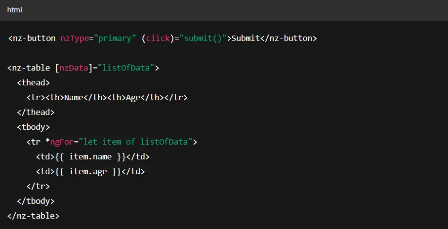
HOW IT WORKS:
Installation is done via npm (ng add, ng-zorro-antd is the recommended way, which sets up the theme and locale for you).
Once installed, you import NzButtonModule, NzTableModule, etc., for each component you use. In templates, components are prefixed with nz-. Example:
NUMBERS:
BEST USE CASES:
NG-Zorro is best for enterprise admin apps where Ant Design's UX paradigms make sense. I'd recommend NG-Zorro for dashboards, management systems, B2B applications, or any app where a clean, information-dense UI is needed.
If your developers are comfortable reading through NG-Zorro's docs and GitHub issues (occasionally in Chinese, but most have English as well), you'll be fine.
USED BY:
Alibaba — Internal systems and admin platforms
Tencent — Enterprise tooling
Huawei — CRM and analytics apps
Baidu — Internal dashboards
And many startups and enterprise teams use Angular to build business-grade web applications with Ant Design styling.
Nebular
Nebular is a customizable Angular UI component library that contains 40+ UI components, four visual themes, and Auth and Security modules. It provides a set of customizable UI components with a modern, clean design inspired by the EVA Design System.
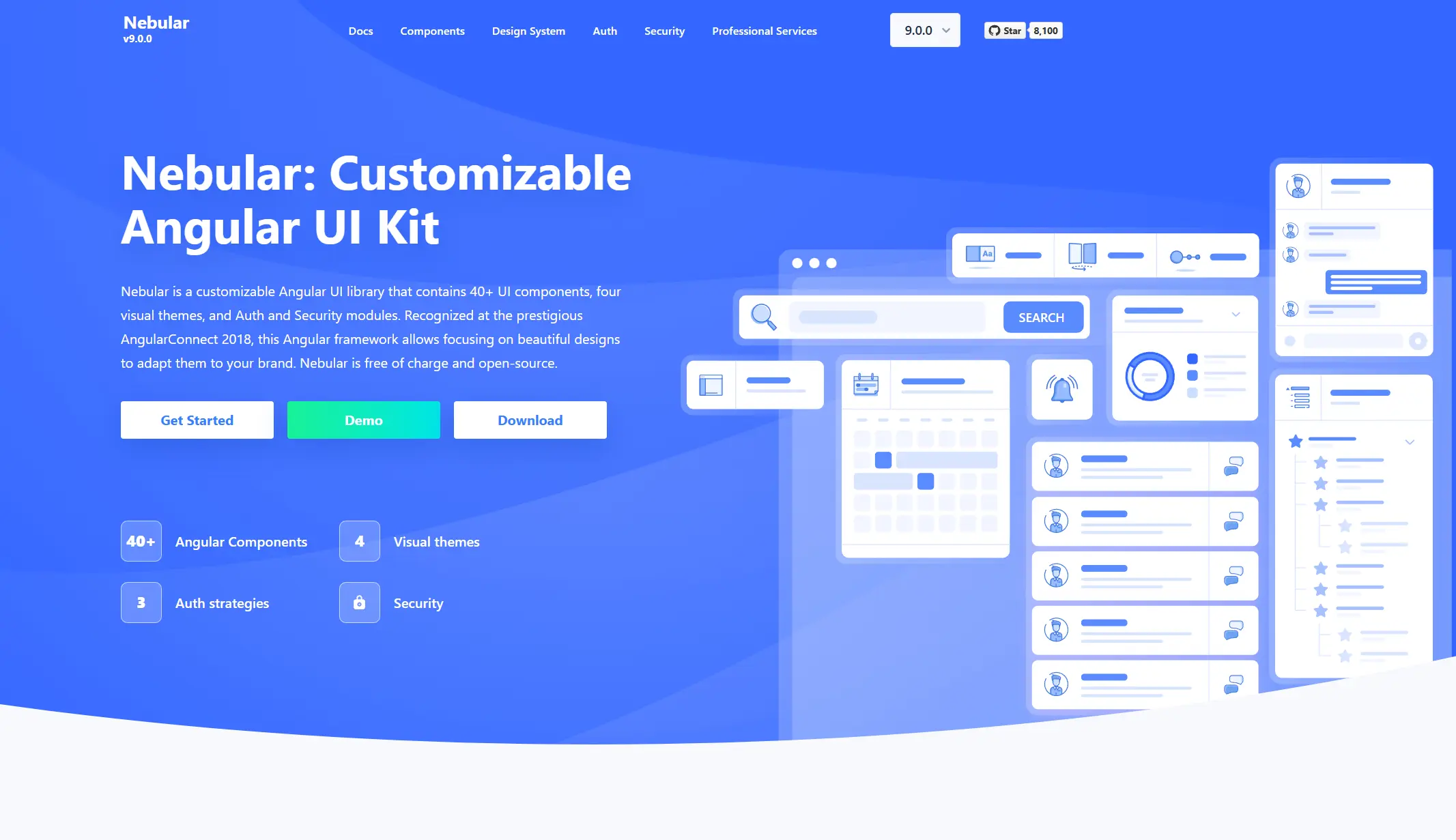
KEY FEATURES:
40+ UI Components + Auth Modules:
Nebular includes all the basic Angular components like buttons, cards, tabs, accordions, and modals, following a cohesive design. It comes with four built-in themes, including dark mode, which you can adapt easily.
Theme and Design Flexibility:
Nebular's components are theme-able. With a few configuration variables, you can change the primary colors and fonts across all components. The Eva Design it uses is sleek – kind of similar to Material in spirit but a bit more neutral. Eva Icons (480+ SVG icons) are integrated for use in buttons, menus, etc., which means you have an icon set readily available.
Security & Auth Integration:
Nebular provides a NbAuthModule that can handle common auth scenarios. It's not tied to a backend – instead, it gives you components and services to facilitate login pages, token handling, and even social auth strategy hooks.
Responsive and Mobile Friendly:
The Nebular components are responsive, and the menu collapses nicely for mobile. Since it's built by the same team that made ngx-admin, they have ensured the components work in a responsive grid layout. They also have some layout components to create columns, rows, and responsive breakpoints in your app.
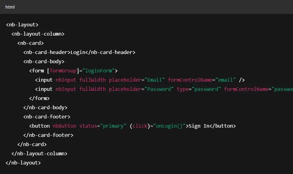
HOW IT WORKS:
To get started with Nebular, you install it via the Angular CLI.
Nebular components are structured around layout containers (nb-layout, nb-sidebar, etc.) and styled UI elements like cards, buttons, and form inputs. It's modular, so you only import what you need.
Here's a basic example of a login form using Nebular's UI components:
NUMBERS:
BEST USE CASES:
Nebular is tailor-made for admin dashboards, CMS, and analytic apps. Basically, if you're building an application where you need a configurable dashboard with a sidebar menu, user authentication, and roles/permissions, Nebular gives you a huge head start.
Nebular might not be a fit if you need a unique public-facing design – it has a distinct style. It's also probably not needed for very small apps or if you only want one or two components.
USED BY:
Akveo — The creators of Nebular use it in their internal projects and open-source admin dashboards.
UNICEF — Used in data collection and analytics dashboards for global health and education programs.
National Bank of Rwanda — Web applications and reporting tools built with Nebular and ngx-admin.
Decathlon — Internal tooling and logistics dashboards in Angular.
Clarity
Clarity is an Angular-based design system and UI component library developed by VMware. It combines a clean, minimalist visual style with strong accessibility and UX standards.
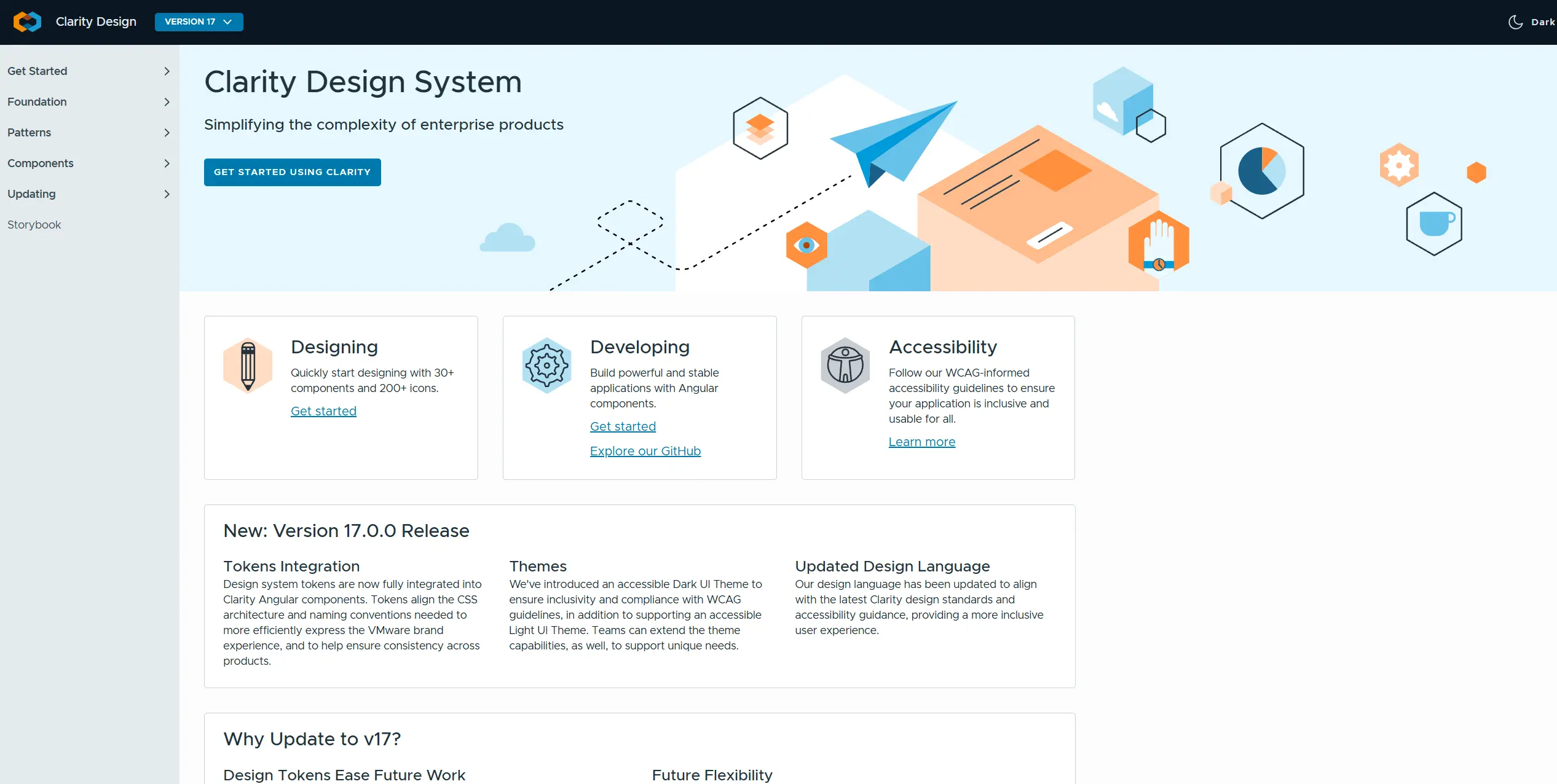
Unlike some Angular libraries that bundle components, Clarity provides a complete design system — including UX guidelines, a layout engine, and flexible theming.
KEY FEATURES:
Well-Designed Components for Data-Heavy UIs:
Clarity's components were built with enterprise scenarios in mind. For example, the Clarity Datagrid is a powerful component that supports pagination, sorting, filtering, selection, and even server-driven modes. It's very much aimed at managing and displaying data sets.
Accessibility and Usability:
The components are accessible by screen readers and keyboard navigation. The design guidelines also stress things like proper contrast. This is important for products that might be used in governmental or health contexts where accessibility is mandated.
Responsive by Design:
Clarity's CSS includes a flexbox grid and utility classes, and all components are responsive. It was designed mobile-first, despite being used a lot on desktop apps. So you can build a responsive app without needing an external grid system.
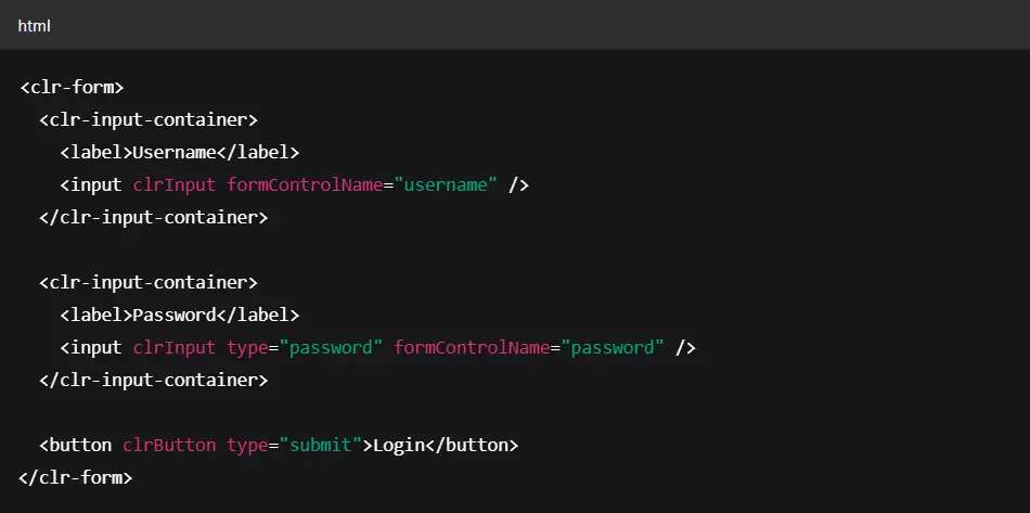
HOW IT WORKS:
Install Clarity using Angular CLI. You can then import only what you need — e.g., ClarityModule or more granular modules like ClrDatagridModule or ClrFormsModule.
Here's an example of a simple Clarity form card with inputs and a button:
NUMBERS:
BEST USE CASES:
Clarity is best when you want a unified design system for an enterprise app, especially if you're building something like a cloud management UI, admin panel, or any application with lots of forms and tables that need to be reliable and accessible. It's been battle-tested in VMware's enterprise software – that's a big plus if your use case is similar.
However, Clarity might be overkill for simple apps or too prescriptive if you already have your branding. It's the datagrid, while powerful, can be heavier than needed for simple tables. Clarity is also a great choice if accessibility is a first-class requirement – few Angular libs other than Material match Clarity in that regard.
USED BY:
VMware — The library's creators use Clarity across their entire product suite (vSphere, Cloud Director, etc.)
Dell EMC — Cloud infrastructure tools and configuration interfaces
British Telecom — Enterprise internal dashboards
SUSE — System management apps and admin panels
And hundreds of SaaS and infrastructure teams that need reliable, accessible, enterprise-ready Angular components that feel consistent without custom design work.
ngx-bootstrap
ngx-bootstrap brings Bootstrap's popular components into the Angular ecosystem. It's ideal for teams already using Bootstrap for styling or transitioning legacy apps to Angular.
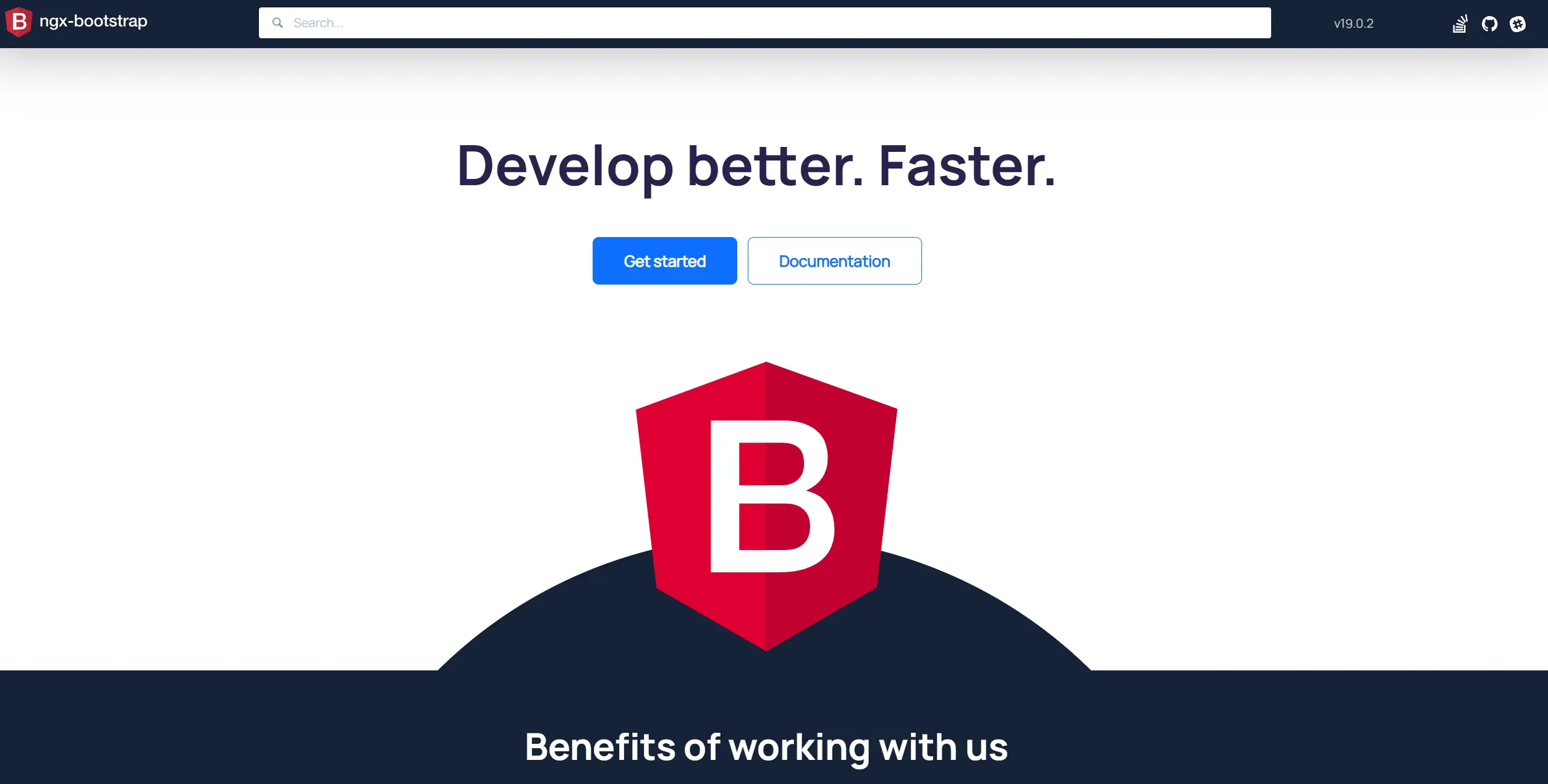
Unlike some Angular UI libraries that force a design system, ngx-bootstrap keeps the Bootstrap 3/4/5 look, making it great for simple UIs.
KEY FEATURES:
Bootstrap 4+ Components without jQuery:
NG Bootstrap provides all the core Bootstrap components – accordion, alerts, buttons, carousel, collapse, dropdown, modal, pagination, popover, Progress, rating, tabs, tooltips, typeahead, etc. – implemented in Angular. You get to use the markup and classes you know from Bootstrap, but powered by Angular templates and logic instead of the old jQuery plugins.
Lightweight:
Because it doesn't include any CSS and only exports Angular components, NG Bootstrap is lightweight. You only import what you need. So, if your app already uses Bootstrap CSS, perhaps for layout or a custom theme built on Bootstrap, adding NG Bootstrap will introduce minimal overhead.
Alignment with Angular Versions:
NG Bootstrap tracks Angular releases closely. It means if you upgrade Angular, you'll typically update NG Bootstrap to the matching major version. The project is open-source and community-driven, so it's quite reliable and widely used.
Install it via NPM.
HOW IT WORKS:
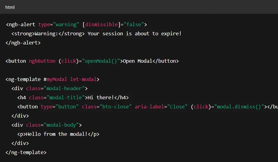
Install the library (npm install @ng-bootstrap/ng-bootstrap). Then, import NgbModule or specific sub-modules into your app module. For example, if you only need Accordion and Modal, you could import NgbAccordionModule and NgbModalModule instead of the entire NgbModule. In templates, the usage will feel familiar if you know Bootstrap's structure, but with an Angular twist. For example:
NUMBERS:
BEST USE CASES:
Choose NG Bootstrap if you already have a Bootstrap-based design or theme for your application. Many admin templates for Angular, especially a couple of years ago, were built on NG Bootstrap because it allowed using popular Bootstrap themes in an Angular context. It's also great for teams transitioning from AngularJS + UI Bootstrap (the AngularJS era library) – the syntax will feel somewhat familiar.
Applications that need to be lightweight and straightforward will benefit too. NG Bootstrap gives you only what you need. However, if your design language is not Bootstrap or you need more advanced components (Bootstrap doesn't have things like charts, schedulers, etc.), you might lean on other libraries.
USED BY:
Cisco — Internal tooling and device management UIs
HP — Admin panels and device configuration portals
U.S. Department of Veterans Affairs — Government apps using Bootstrap + Angular
Wolters Kluwer — Finance and compliance dashboards
And many enterprise teams are bridging the gap between Bootstrap legacy apps and modern Angular architecture.
Kendo UI
Kendo UI for Angular is a from-scratch Angular implementation that offers a professional-grade, comprehensive set of UI components.
If you're willing to invest in a paid library for guaranteed support and top-notch quality, Kendo UI is often at the top of the list. It's known for its rich datagrid, scheduler, charts, and other complex components, as well as a polished feel.
KEY FEATURES:
120+ Angular Native Components:
Kendo UI includes every basic element and a plethora of advanced ones: data grid (with inline editing, grouping, export to PDF/Excel), pivot grid, schedulers/calendars, rich text editor, diagram, Gantt chart, spreadsheets, etc. If there's a UI widget you can think of, Kendo likely has it.
Professional Design & Theming:
Kendo UI components come with a few well-crafted themes (Default, Material, Bootstrap, etc.), and you can customize them via Sass variables or the online ThemeBuilder. They also have a Figma UI kit for designers to prototype using Kendo components.
Performance and Stability:
As a product backed by a company, Kendo UI prioritizes performance optimizations. Virtual scrolling, efficient DOM updates, and responsive design are built in. For example, the data grid can handle large data sets gracefully with virtualization. They also ensure compatibility with the latest Angular versions promptly and have long-term support options.
Documentation and Support:
Kendo's documentation is excellent, with detailed API references and examples for each component. As a paying customer, you get access to Progress's support ticket system, which can be a lifesaver for tight deadlines. They also have community forums. Beyond docs, Kendo provides integrations and regularly updates with new components/features.
HOW IT WORKS:
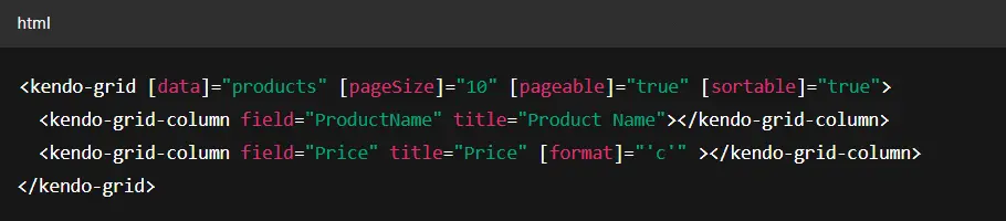
Being a commercial library, the setup is more involved than just npm install. You need to have a license. After installation, you import the desired Kendo Angular modules, similar to any Angular library. For example, to use their grid and some inputs, you'd import GridModule and InputsModule from @progress/kendo-angular-grid and @progress/kendo-angular-inputs. They have a single package per group of components. Once imported, you use the components with the kendo prefix in your templates:
NUMBERS:
⭐GitHub: 2.6k stars
📥NPM: 48k downloads/week
💰 Paid license. Starts at ~$899/year with support & upgrades
BEST USE CASES:
Kendo UI for Angular is ideal for enterprise applications where UI quality and support are paramount. If you're building a complex line-of-business application that needs advanced features like spreadsheet grids, Gantt charts, and schedulers – and you have the budget for components – Kendo is a top choice. CTOs often choose Kendo when they want vendor accountability – you can call on Progress if something is broken or if you need a feature, which is comforting when running large projects.
Use Kendo UI when you need robust, feature-rich UI components with guaranteed support and you're okay with a commercial solution.
USED BY:
Microsoft — Internal line-of-business apps
Siemens — Industrial control UIs
Fujitsu — Enterprise reporting and management tools
LexisNexis — Legal research dashboards
Schneider Electric — Power management systems
And hundreds of mid-to-large enterprises that prioritize reliability, compliance, and vendor-backed UI infrastructure in Angular.
Benefits of Using Angular UI Library
Below are a few of the benefits of using an Angular UI component library:
Speed and Efficiency:
UI libraries save development time. Instead of building and styling a dropdown, modal, or datagrid from scratch and dealing with cross-browser quirks, you can drop in a well-tested component and move on to coding business logic.
Consistency and UX Quality:
A library provides a consistent look and feel across your application. Moreover, popular libraries are designed by UX experts following established guidelines (e.g., Material Design or Ant Design), so you inherit good usability practices.
Accessibility (a11y):
Libraries like Angular Material and Clarity ship with WCAG-compliant components out of the box — keyboard navigation, screen reader support, and proper contrast.
Community and Support:
When using a widely adopted library, you gain the advantage of community knowledge. Got an issue? It's likely asked and answered on StackOverflow or GitHub. Need a feature? Someone has already extended the library, or there's a plugin available. If it's a commercial library, you often get formal support – you can file a ticket and get help, which can de-risk projects for enterprises.
Integration with Angular Ecosystem:
Angular UI libraries often integrate nicely with other Angular features.
Adaptability and Theming:
Many UI libraries are themeable – you can adjust them to fit your brand. This gives you the benefit of a custom look without reinventing the wheel.
Future-proofing:
When Angular updates or browser standards change, library maintainers usually update their packages accordingly.
Wrapping Up
The first thing I need to say is that Angular is still one of the best tools for building and maintaining enterprise applications. And UI libraries are the secret weapon that helps Angular teams build faster, with better logic, stronger UX, and far less wasted effort.
But the real question isn't "Which library has the most stars?"
It's "Which one makes your team faster, your UI more consistent, and your app easier to maintain?"
From my experience working with teams across SaaS, fintech, and platform products, it's better to pick a good UI library early and integrate it as part of your architecture. Changing UI libraries halfway through a project is expensive. Building your own without a solid reason is even worse.
The right library gives your team a competitive edge. It saves you months, not just hours. So don't chase hype. Make the choice that fits your team's workflow and your product's long-term goals.
Unlock the full potential of your product

Boost customer retention & satisfaction
Become more competitive on the market
Move to the latest technologies stacks
Improve usability & visual appeal
FAQ


Alex Vasylenko is the founder of The Frontend Company, DBC and several other successful startups. A dynamic tech entrepreneur, he began his career as a frontend developer at Deloitte and Scandinavia's largest banking company. In 2023, Alex was honored as one of 'Top 10 Emerging Entrepreneurs' by USA Today.
RATE
Rate this article please
This will help us provide more useful information.
1782 ratings, average 4.99 out of 5